Interactive Porto Insights - A Plot.ly Tutorial
Introduction
This competition is hosted by the third largest insurance company in Brazil: Porto Seguro with the task of predicting the probability that a driver will initiate an insurance claim in the next year.
This notebook will aim to provide some interactive charts and analysis of the competition data by way of the Python visualisation library Plot.ly and hopefully bring some insights and beautiful plots that others can take and replicate. Plot.ly is one of the main products offered by the software company - Plotly which specializes in providing online graphical and statistical visualisations (charts and dashboards) as well as providing an API to a whole rich suite of programming languages and tools such as Python, R, Matlab, Node.js etc.
Listed below for easy convenience are links to the various Plotly plots in this notebook:
- Simple horizontal bar plot - Used to inspect the Target variable distribution
- Correlation Heatmap plot - Inspect the correlation between the different features
- Scatter plot - Compare the feature importances generated by Random Forest and Gradient-Boosted model
- Vertical bar plot - List in Descending order, the importance of the various features
- 3D Scatter plot
The themes in this notebook can be briefly summarized follows:
1. Data Quality Checks - Visualising and evaluating all missing/Null values (values that are -1)
2. Feature inspection and filtering - Correlation and feature Mutual information plots against the target variable. Inspection of the Binary, categorical and other variables.
3. Feature importance ranking via learning models /n Building a Random Forest and Gradient Boosted model to help us rank features based off the learning process.
# Let us load in the relevant Python modules
import pandas as pd
import numpy as np
import seaborn as sns
import matplotlib.pyplot as plt
%matplotlib inline
import plotly.offline as py
py.init_notebook_mode(connected=True)
import plotly.graph_objs as go
import plotly.tools as tls
import warnings
from collections import Counter
from sklearn.feature_selection import mutual_info_classif
warnings.filterwarnings('ignore')
Let us load in the training data provided using Pandas:
train = pd.read_csv("../input/train.csv")
train.head()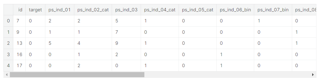
# Taking a look at how many rows and columns the train dataset contains
rows = train.shape[0]
columns = train.shape[1]
print("The train dataset contains {0} rows and {1} columns".format(rows, columns))- print('{} {}.format(' ', ' ')) >> 중괄호 안에 인덱스 숫자 넣어주기(여기서는 rows가 인덱스 0, columns가 인덱스 1)
The train dataset contains 595212 rows and 59 columns- 훈련 데이터셋은 595212개의 rows와 59개의 column으로 이루어져 있다.
1. Data Quality checks
Null or missing values check
As part of our quality checks, let us quick look at whether there are any null values in the train dataset as follows:
# any() applied twice to check run the isnull check across all columns.
train.isnull().any().any()- 모든 column들에 대해 null값을 탐색하기 위해 any()를 2번 적용
False- Our null values check returns False but however, this does not really mean that this case has been closed as the data is also described as "Values of -1 indicate that the feature was missing from the observation". Therefore I take it that Porto Seguro has simply conducted a blanket replacement of all null values in the data with the value of -1. Let us now inspect if there where any missing values in the data.
- 출력 결과는 False이지만, null값은 -1로 대체되었기 때문에 이 훈련 세트에 null값이 없다고 말할 수 없음 >> 데이터셋에 결측치가 있는지 검사해야 함
Here we can see that which columns contained -1 in their values so we could easily for example make a blanket replacement of all -1 with nulls first as follows:
train_copy = train
train_copy = train_copy.replace(-1, np.NaN)- -1값들을 null로 대체하면 결측치를 쉽게 확인할 수 있음 >> train_copy 데이터프레임 새로 만들고 여기에 데이터셋 넣어줌
Next, we can use resident Kaggler's Aleksey Bilogur - creator of the "Missingno" package which is a most useful and convenient tool in visualising missing values in the dataset, so check it out.
- Missingno를 활용하여 데이터셋의 결측치를 시각화
import missingno as msno
# Nullity or missing values by columns
msno.matrix(df=train_copy.iloc[:,2:39], figsize=(20, 14), color=(0.42, 0.1, 0.05))
As we can see, the missing values now become much more apparent and clear when we visualise it, where the empty white bands (data that is missing) superposed on the vertical dark red bands (non-missing data) reflect the nullity of the data in that particular column. In this instance, we can observe that there are 7 features out of the 59 total features (although as rightly pointed out by Justin Nafe in the comments section there are really a grand total of 13 columns with missing values) that actually contained null values. This is due to the fact that the missingno matrix plot can only comfortable fit in approximately 40 odd features to one plot after which some columns may be excluded, and hence the remaining 5 null columns have been excluded. To visualize all nulls, try changing the figsize argument as well as tweaking how we slice the dataframe.
For the 7 null columns that we are able to observe, they are hence listed here as follows:
ps_ind_05_cat | ps_reg_03 | ps_car_03_cat | ps_car_05_cat | ps_car_07_cat | ps_car_09_cat | ps_car_14
Most of the missing values occur in the columns suffixed with _cat. One should really take further note of the columns ps_reg_03, ps_car_03_cat and ps_car_05_cat. Evinced from the ratio of white to dark bands, it is very apparent that a big majority of values are missing from these 3 columns, and therefore a blanket replacement of -1 for the nulls might not be a very good strategy.
- 전체 59개의 feature중 7개의 feature가 실제로 null값을 포함하고 있음
- 모든 feature들에서 null값을 관측하기 위해 figsize의 인수를 변경하면서 데이터 프레임을 분할시켜야 함
- 대부분의 결측치는 _cat이 붙은 열에서 발생
- ps_reg_03, ps_car_03_cat, ps_car_05_cat >> 대부분의 값이 누락됨, 여기서 null값들을 -1로 대체하는 것은 어려움
Target variable inspection
Another standard check normally conducted on the data is with regards to our target variable, where in this case, the column is conveniently titled "target". The target value also comes by the moniker of class/label/correct answer and is used in supervised learning models along with the corresponding data that is given (in our case all our train data except the id column) to learn the function that best maps the data to our target in the hope that this learned function can generalize and predict well with new unseen data.
data = [go.Bar(
            x = train["target"].value_counts().index.values,
            y = train["target"].value_counts().values,
            text='Distribution of target variable'
    )]

layout = go.Layout(
    title='Target variable distribution'
)

fig = go.Figure(data=data, layout=layout)

py.iplot(fig, filename='basic-bar')
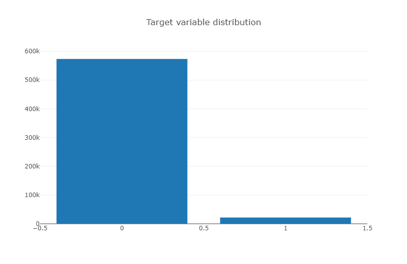
Hmmn, the target variable is rather imbalanced so it might be something to keep in mind. An imbalanced target will prove quite
- 훈련 세트의 target value(1 or 0) 불균형(0이 훨씬 많음)
Datatype check
This check is carried out to see what kind of datatypes the train set is comprised of : integers or characters or floats just to gain a better overview of the data we were provided with. One trick to obtain counts of the unique types in a python sequence is to use the Counter method, when you import the Collections module as follows:
Counter(train.dtypes.values)- Counter 생성자는 여러 형태의 데이터를 인자로 받음 >> 먼저 중복된 데이터가 저장된 배열을 인자로 넘기면 각 원소가 몇 번씩 나오는지가 저장된 객체를 얻게 됨
- (출처 : https://www.daleseo.com/python-collections-counter/)
Counter({dtype('int64'): 49, dtype('float64'): 10})As alluded to above, there are a total of 59 columns that make up the train dataset and as we can observe from this check, the features/columns consist of only two datatypes - Integer and floats.
- 훈련 세트의 feature는 49개의 int형 데이터타입과 10개의 floats형 데이터타입으로 구성되어 있음
Another point to note is that Porto Seguro has actually provided us data with headers that come suffixed with abbreviations such as "_bin", "_cat" and "_reg", where they have given us a rough explanation that _bin indicates binary features while _cat indicates categorical features whilst the rest are either continuous or ordinal features. Here I shall simplify this a bit further just by looking at float values (probably only the continuous features) and integer datatypes (binary, categorical and ordinal features).
- 이전의 노트북과 달리 데이터타입을 bin, cat, ect로 나누지 않고 float, int 두 가지 형태로만 분류
train_float = train.select_dtypes(include=['float64'])
train_int = train.select_dtypes(include=['int64'])
Correlation plots
As a starter, let us generate some linear correlation plots just to have a quick look at how a feature is linearly correlated to the next and perhaps start gaining some insights from here. At this juncture, I will use the seaborn statistical visualisation package to plot a heatmap of the correlation values. Conveniently, Pandas dataframes come with the corr() method inbuilt, which calculates the Pearson correlation. Also as convenient is Seaborn's way of invoking a correlation plot. Just literally the word "heatmap"
- 각 feature들 사이의 상관관계를 한 눈에 보기 위해 heatmap 사용
Correlation of float features
colormap = plt.cm.magma
plt.figure(figsize=(16,12))
plt.title('Pearson correlation of continuous features', y=1.05, size=15)
sns.heatmap(train_float.corr(),linewidths=0.1,vmax=1.0, square=True,
            cmap=colormap, linecolor='white', annot=True)
From the correlation plot, we can see that the majority of the features display zero or no correlation to one another. This is quite an interesting observation that will warrant our further investigation later down. For now, the paired features that display a positive linear correlation are listed as follows:
(ps_reg_01, ps_reg_03)
(ps_reg_02, ps_reg_03)
(ps_car_12, ps_car_13)
(ps_car_13, ps_car_15)
- 대부분의 feature들이 서로 상관 관계가 0에 가깝다 (거의 관련이 없다) >> 추후에 관찰할 만한 특성
Correlation of integer features
For the columns of interger datatype, I shall now switch to using the Plotly library to show how one can also generate a heatmap of correlation values interactively. Much like our earlier Plotly plot, we generate a heatmap object by simply invoking the "go.Heatmap". Here we have to provide values to three different axes, where x and y axes take in the column names while the correlation value is provided by the z-axis. The colorscale attribute takes in keywords that correspond to different color palettes that you will see in the heatmap where in this example, I have used the Greys colorscale (others include Portland and Viridis - try it for yourself).
- 정수형 데이터타입 사이의 상관관계를 Plotly plot으로 시각화
- go.Heatmap을 사용하기 위해 x축, y축(column이름), z축 (상관관계 수치)을 제공해야 함
#train_int = train_int.drop(["id", "target"], axis=1)
# colormap = plt.cm.bone
# plt.figure(figsize=(21,16))
# plt.title('Pearson correlation of categorical features', y=1.05, size=15)
# sns.heatmap(train_cat.corr(),linewidths=0.1,vmax=1.0, square=True, cmap=colormap, linecolor='white', annot=False)
data = [
    go.Heatmap(
        z= train_int.corr().values,
        x=train_int.columns.values,
        y=train_int.columns.values,
        colorscale='Viridis',
        reversescale = False,
        text = True ,
        opacity = 1.0 )
]

layout = go.Layout(
    title='Pearson Correlation of Integer-type features',
    xaxis = dict(ticks='', nticks=36),
    yaxis = dict(ticks='' ),
    width = 900, height = 700)

fig = go.Figure(data=data, layout=layout)
py.iplot(fig, filename='labelled-heatmap')- go.layout.Template() 을 활용하여 그래프 Layout에 관련된 템플릿 제작이 가능 (출처 : https://wikidocs.net/186974)

Similarly, we can observe that there are a huge number of columns that are not linearly correlated with each other at all, evident from the fact that we observe quite a lot of 0 value cells in our correlation plot. This is quite a useful observation to us, especially if we are trying to perform dimensionality reduction transformations such as Principal Component Analysis (PCA), this would require a certain degree of correlation . We can note some features of interest are as follows:
Negatively correlated features : ps_ind_06_bin, ps_ind_07_bin, ps_ind_08_bin, ps_ind_09_bin
One interesting aspect to note is that in our earlier analysis on nullity, ps_car_03_cat and ps_car_05_cat were found to contain many missing or null values. Therefore it should come as no surprise that both these features show quite a strong positive linear correlation to each other on this basis, albeit one that may not really reflect the underlying truth for the data.
- 많은 feature들이 서로 상관관계가 매우 낮은 것으로 드러남
- ps_car_03과 ps_car_05_cat 은 모두 결측치가 데이터의 대부분을 차지 >> 양의 상관관계가 나타나는 것이 당연함
Mutual Information plots
Mutual information is another useful tool as it allows one to inspect the mutual information between the target variable and the corresponding feature it is calculated against. For classification problems, we can conveniently call Sklearn's mutual_info_classif method which measures the dependency between two random variables and ranges from zero (where the random variables are independent of each other) to higher values (indicate some dependency). This therefore will help give us an idea of how much information from the target may be contained within the features.
The sklearn implementation of the mutual_info_classif function tells us that it "relies on nonparametric methods based on entropy estimation from k-nearest neighbors distances", where you can go into more detail on the official sklearn page in the link here.
- mutual_info_classif : 서로 다른 두 랜덤 변수 사이의 상관관계 측정, 사이킷런의 mutual_info_classif 메서드로 호출 (호출값이 0이면 두 변수는 서로 독립적인 관계, 호출값이 높으면 두 변수는 상호의존적)
- k-최근접 이웃 거리의 엔트로피 추정에 기반한 비모수 방법에 의존
mf = mutual_info_classif(train_float.values,train.target.values,n_neighbors=3, random_state=17 )
print(mf)
[ 0.01402035 0.00431986 0.0055185 0.00778454 0.00157233 0.00197537
0.01226 0.00553038 0.00545101 0.00562139]
Binary features inspection
Another aspect of the data that we may want to inspect would be the columns that only contain binary values, i.e where values take on only either of the two values 1 or 0. Proceeding, we store all columns that contain these binary values and then generate a vertical plotly barplot of these binary values as follows:
- 0과 1로 이루어진 Binary feature들에 대해 0, 1의 비율을 Plotly의 barplot으로 시각화
bin_col = [col for col in train.columns if '_bin' in col]
zero_list = []
one_list = []
for col in bin_col:
    zero_list.append((train[col]==0).sum())
    one_list.append((train[col]==1).sum())
trace1 = go.Bar(
x=bin_col,
y=zero_list ,
name='Zero count'
)
trace2 = go.Bar(
x=bin_col,
y=one_list,
name='One count'
)
data = [trace1, trace2]
layout = go.Layout(
barmode='stack',
title='Count of 1 and 0 in binary variables'
)
fig = go.Figure(data=data, layout=layout)
py.iplot(fig, filename='stacked-bar')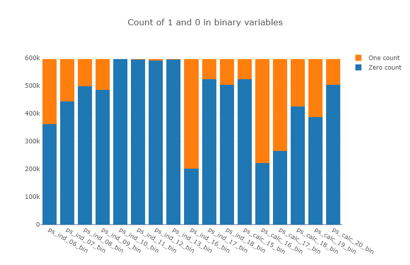
Here we observe that there are 4 features : ps_ind_10_bin, ps_ind_11_bin, ps_ind_12_bin, ps_ind_13_bin which are completely dominated by zeros. This begs the question of whether these features are useful at all as they do not contain much information about the other class vis-a-vis the target.
- ps_ind_10_bin, ps_ind_11_bin, ps_ind_12_bin, ps_ind_13_bin >> 1은 없고 0만이 모든 비율을 차지, 많은 정보를 담고있는지 의문 + 추후에 유용하게 사용되지 않을 수 있음
Categorical and Ordinal feature inspection
Let us first take a look at the features that are termed categorical as per their suffix "_cat".
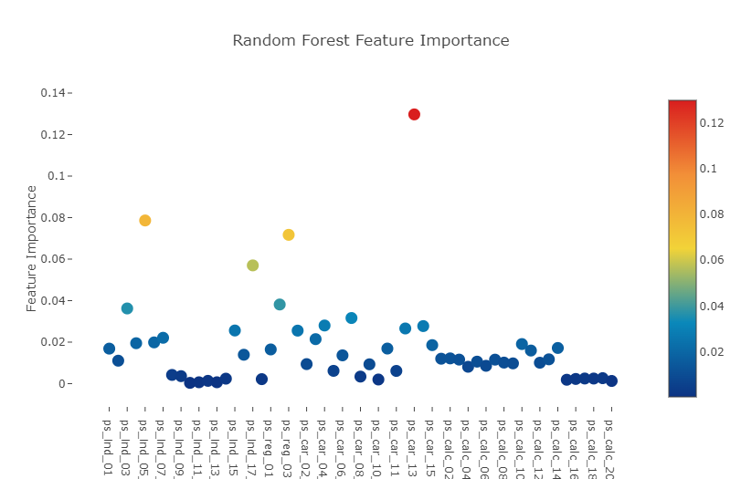
Feature importance via Random Forest
- Random Forest을 통해 Feature들 사이의 중요한 정도 탐색
Let us now implement a Random Forest model where we fit the training data with a Random Forest Classifier and look at the ranking of the features after the model has finished training. This is a quick way of using an ensemble model (ensemble of weak decision tree learners applied under Bootstrap aggregated) which does not require much parameter tuning in obtaining useful feature importances and is also pretty robust to target imbalances. We call the Random Forest as follows:
from sklearn.ensemble import RandomForestClassifier
rf = RandomForestClassifier(n_estimators=150, max_depth=8, min_samples_leaf=4, max_features=0.2, n_jobs=-1, random_state=0)
rf.fit(train.drop(['id', 'target'],axis=1), train.target)
features = train.drop(['id', 'target'],axis=1).columns.values
print("----- Training Done -----")
----- Training Done -----
- Random Forest를 사용하여 매개 변수 조정 없이 빠르게 매우 강력한 앙상블 모델을 사용할 수 있음
Plot.ly Scatter Plot of feature importances
Having trained the Random Forest, we can obtain the list of feature importances by invoking the attribute "featureimportances" and plot our next Plotly plot, the Scatter plot.
Here we invoke the command Scatter and as per the previous Plotly plots, we have to define our y and x-axes. However the one thing that we pay attention to in scatter plots is the marker attribute. It is the marker attribute where we define and hence control the size, color and scale of the scatter points embedded.
- Random Forest로 모델 훈련, feature들의 중요도에 대한 정보를 얻을 수 있음 >> feature_importances와 Plotly plot(산점도)로 feature들의 중요도를 시각화
- marker attribute >> 산점도는 marker attribute, 내장된 산란점의 크기, 생상 및 척도를 정하고 제어
# Scatter plot
trace = go.Scatter(
    y = rf.feature_importances_,
    x = features,
    mode='markers',
    marker=dict(
        sizemode = 'diameter',
        sizeref = 1,
        size = 13,
        #size= rf.feature_importances_,
        #color = np.random.randn(500), #set color equal to a variable
        color = rf.feature_importances_,
        colorscale='Portland',
        showscale=True
    ),
    text = features
)
data = [trace]
layout= go.Layout(
    autosize= True,
    title= 'Random Forest Feature Importance',
    hovermode= 'closest',
     xaxis= dict(
         ticklen= 5,
         showgrid=False,
        zeroline=False,
        showline=False
     ),
    yaxis=dict(
        title= 'Feature Importance',
        showgrid=False,
        zeroline=False,
        ticklen= 5,
        gridwidth= 2
    ),
    showlegend= False
)
fig = go.Figure(data=data, layout=layout)
py.iplot(fig,filename='scatter2010')
Furthermore we could also display a sorted list of all the features ranked by order of their importance, from highest to lowest via the same plotly barplots as follows:
- Plotly barplots를 통해 중요도가 높은 순으로 모든 feature들을 정렬시킬 수 있음
x, y = (list(x) for x in zip(*sorted(zip(rf.feature_importances_, features),
                                                            reverse = False)))
trace2 = go.Bar(
    x=x ,
    y=y,
    marker=dict(
        color=x,
        colorscale = 'Viridis',
        reversescale = True
    ),
    name='Random Forest Feature importance',
    orientation='h',
)

layout = dict(
    title='Barplot of Feature importances',
     width = 900, height = 2000,
    yaxis=dict(
        showgrid=False,
        showline=False,
        showticklabels=True,
#         domain=[0, 0.85],
    ))
fig1 = go.Figure(data=[trace2])
fig1['layout'].update(layout)
py.iplot(fig1, filename='plots')
Decision Tree visualisation
One other interesting trick or technique oft used would be to visualize the tree branches or decisions made by the model. For simplicity, I fit a decision tree (of max_depth = 3) and hence you only see 3 levels in the decision branch, use the export to graph visualization attribute in sklearn "export_graphviz" and then export and import the tree image for visualization in this notebook.
- 결정 트리 시각화 >> 트릭 모델을 활용하여 데이터의 결정을 시각화, max_depth=3으로 설정하여 3단계로 구성된 decision branch를 출력
from sklearn import tree
from IPython.display import Image as PImage
from subprocess import check_call
from PIL import Image, ImageDraw, ImageFont
import re

decision_tree = tree.DecisionTreeClassifier(max_depth = 3)
decision_tree.fit(train.drop(['id', 'target'],axis=1), train.target)

# Export our trained model as a .dot file
with open("tree1.dot", 'w') as f:
     f = tree.export_graphviz(decision_tree,
                              out_file=f,
                              max_depth = 4,
                              impurity = False,
                              feature_names = train.drop(['id', 'target'],axis=1).columns.values,
                              class_names = ['No', 'Yes'],
                              rounded = True,
                              filled= True )

#Convert .dot to .png to allow display in web notebook
check_call(['dot','-Tpng','tree1.dot','-o','tree1.png'])
# Annotating chart with PIL
img = Image.open("tree1.png")
draw = ImageDraw.Draw(img)
img.save('sample-out.png')
PImage("sample-out.png",)
Feature importance via Gradient Boosting model
Just for curiosity, let us try another learning method in getting our feature importances. This time, we use a Gradient Boosting classifier to fit to the training data . Gradient Boosting proceeds in a forward stage-wise fashion, where at each stage regression tress are fitted on the gradient of the loss function (which defaults to the deviance in Sklearn implementation).
- 위의 결정트리 대신 feature들의 중요도를 확인할 수 있는 다른 학습 방법을 시도 >> Gradient Boosting classifier이라는 분류기를 사용, 훈련 세트를 fit 시킬 것.
- Gradient Boosting은 각 단계에서 loss fungtion의 기울기에 각각의 stage regression이 fit하는 stage-wise fashion을 사용
from sklearn.ensemble import GradientBoostingClassifier
gb = GradientBoostingClassifier(n_estimators=100, max_depth=3, min_samples_leaf=4, max_features=0.2, random_state=0)
gb.fit(train.drop(['id', 'target'],axis=1), train.target)
features = train.drop(['id', 'target'],axis=1).columns.values
print("----- Training Done -----")
----- Training Done -----
# Scatter plot
trace = go.Scatter(
    y = gb.feature_importances_,
    x = features,
    mode='markers',
    marker=dict(
        sizemode = 'diameter',
        sizeref = 1,
        size = 13,
        #size= rf.feature_importances_,
        #color = np.random.randn(500), #set color equal to a variable
        color = gb.feature_importances_,
        colorscale='Portland',
        showscale=True
    ),
    text = features
)
data = [trace]

layout= go.Layout(
    autosize= True,
    title= 'Gradient Boosting Machine Feature Importance',
    hovermode= 'closest',
     xaxis= dict(
         ticklen= 5,
         showgrid=False,
        zeroline=False,
        showline=False
     ),
    yaxis=dict(
        title= 'Feature Importance',
        showgrid=False,
        zeroline=False,
        ticklen= 5,
        gridwidth= 2
    ),
    showlegend= False
)
fig = go.Figure(data=data, layout=layout)
py.iplot(fig,filename='scatter2010')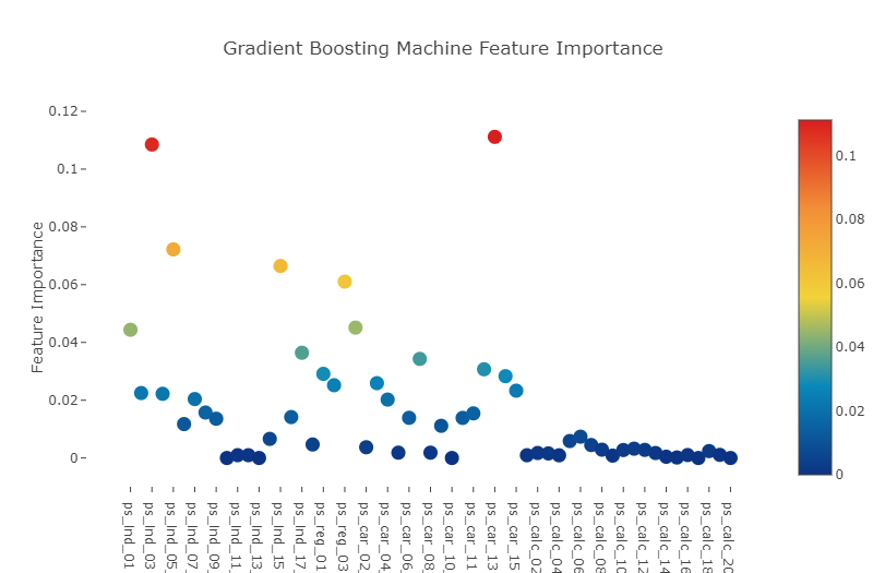
x, y = (list(x) for x in zip(*sorted(zip(gb.feature_importances_, features),
                                                            reverse = False)))
trace2 = go.Bar(
    x=x ,
    y=y,
    marker=dict(
        color=x,
        colorscale = 'Viridis',
        reversescale = True
    ),
    name='Gradient Boosting Classifer Feature importance',
    orientation='h',
)

layout = dict(
    title='Barplot of Feature importances',
     width = 900, height = 2000,
    yaxis=dict(
        showgrid=False,
        showline=False,
        showticklabels=True,
    ))
fig1 = go.Figure(data=[trace2])
fig1['layout'].update(layout)
py.iplot(fig1, filename='plots')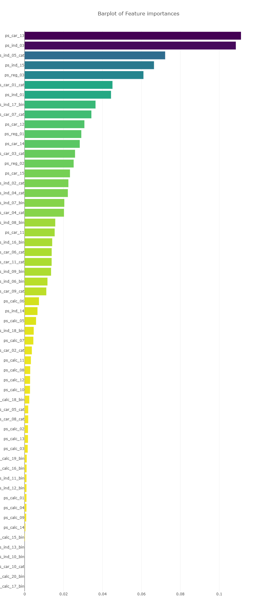
Interestingly we observe that in both Random forest and Gradient Boosted learning models, the most important feature that both models picked out was the column : ps_car_13.
This particular feature warrants further investigation so let us conduct a deep-dive into it.
- Random forest와 Gradient Boost 모델에서 모두 ps_car_13 feature가 가장 중요한 것으로 나타남 >> 추가적으로 심층 조사를 진행할 필요가 있음
Conclusion
We have performed quite an extensive inspection of the Porto Seguro dataset by inspecting for null values and data quality, investigated linear correlations between features, inspected some of the feature distributions as well as implemented a couple of learning models (Random forest and Gradient Boosting classifier) so as to identify features that the models deemed important.
- Porto Seguro 데이터셋의 결측치와 데이터의 quality를 탐색, 각 feature 사이의 상관관계를 조사
- 일부 feature들의 분포 탐색, Random forest와 Gradient Boosting 분류기를 사용하여 학습 모델 구현 >> 각 feature들의 중요도 판별, 그 결과 ps_car_13의 중요도가 가장 높다는 사실을 파악
출처 : https://www.kaggle.com/code/arthurtok/interactive-porto-insights-a-plot-ly-tutorial/notebook
'Project > Data Science 프로젝트' 카테고리의 다른 글
| Data Science 프로젝트 (4주차) (0) | 2023.04.08 |
|---|---|
| Data Science 프로젝트 (3주차) (1) | 2023.04.01 |
| Data Science 프로젝트 (2주차 - 1) (1) | 2023.03.24 |
| Data Science 프로젝트 (1주차 - 4) (0) | 2023.03.18 |
| Data Science 프로젝트 (1주차 - 3) (0) | 2023.03.18 |


