Introduction to Ensembling/Stacking in Python
Introduction
This notebook is a very basic and simple introductory primer to the method of ensembling (combining) base learning models, in particular the variant of ensembling known as Stacking. In a nutshell stacking uses as a first-level (base), the predictions of a few basic classifiers and then uses another model at the second-level to predict the output from the earlier first-level predictions.
The Titanic dataset is a prime candidate for introducing this concept as many newcomers to Kaggle start out here. Furthermore even though stacking has been responsible for many a team winning Kaggle competitions there seems to be a dearth of kernels on this topic so I hope this notebook can fill somewhat of that void.
I myself am quite a newcomer to the Kaggle scene as well and the first proper ensembling/stacking script that I managed to chance upon and study was one written in the AllState Severity Claims competition by the great Faron. The material in this notebook borrows heavily from Faron's script although ported to factor in ensembles of classifiers whilst his was ensembles of regressors. Anyway please check out his script here:
Stacking Starter : by Faron
Now onto the notebook at hand and I hope that it manages to do justice and convey the concept of ensembling in an intuitive and concise manner. My other standalone Kaggle script which implements exactly the same ensembling steps (albeit with different parameters) discussed below gives a Public LB score of 0.808 which is good enough to get to the top 9% and runs just under 4 minutes. Therefore I am pretty sure there is a lot of room to improve and add on to that script. Anyways please feel free to leave me any comments with regards to how I can improve
- Ensembling(결합)하는 방법에 대한 입문서
- 첫 번째 단계(Basic classification의 예측) >> 두 번째 단계 (다른 모델 사용, 첫 번째 단계의 예측 결과를 예측)
- https://velog.io/@fiifa92/Introduction-to-EnsemblingStacking-in-Pytho 블로그의 도움을 받아 이 노트북을 공부함
# Load in our libraries
import pandas as pd
import numpy as np
import re
import sklearn
import xgboost as xgb
import seaborn as sns
import matplotlib.pyplot as plt
%matplotlib inline

import plotly.offline as py
py.init_notebook_mode(connected=True)
import plotly.graph_objs as go
import plotly.tools as tls

import warnings
warnings.filterwarnings('ignore')

# Going to use these 5 base models for the stacking
from sklearn.ensemble import (RandomForestClassifier, AdaBoostClassifier,
                              GradientBoostingClassifier, ExtraTreesClassifier)
from sklearn.svm import SVC
from sklearn.cross_validation import KFold- 플로틀리 오프라인을 사용하여 그래프를 오프라인으로 생성하고 로컬로 저장
- plotly.offline.init_notebook_mode() >> plotly.offline.iplot을 사용할 때 각 노트북 세션의 시작 부분에서 실행, 추가 초기화 단계
- sklearn에서 base models 5개 import
Feature Exploration, Engineering and Cleaning
Now we will proceed much like how most kernels in general are structured, and that is to first explore the data on hand, identify possible feature engineering opportunities as well as numerically encode any categorical features.
- 대부분의 커널이 일반적으로 구조화되는 방식과 매우 유사하게 진행 예정
- 수중에 있는 데이터 탐색, 엔지니어링이 가능한 features 식별, 범주형 데이터들을 수치적으로 인코딩
# Load in the train and test datasets
train = pd.read_csv('../input/train.csv')
test = pd.read_csv('../input/test.csv')

# Store our passenger ID for easy access
PassengerId = test['PassengerId']

train.head(3)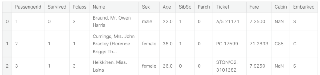
Well it is no surprise that our task is to somehow extract the information out of the categorical variables
- 범주형 데이터들에서 정보 추출
Feature Engineering
Here, credit must be extended to Sina's very comprehensive and well-thought out notebook for the feature engineering ideas so please check out his work
Titanic Best Working Classfier : by Sina
full_data = [train, test]

# Some features of my own that I have added in
# Gives the length of the name
train['Name_length'] = train['Name'].apply(len)
test['Name_length'] = test['Name'].apply(len)
# Feature that tells whether a passenger had a cabin on the Titanic
train['Has_Cabin'] = train["Cabin"].apply(lambda x: 0 if type(x) == float else 1)
test['Has_Cabin'] = test["Cabin"].apply(lambda x: 0 if type(x) == float else 1)

# Feature engineering steps taken from Sina
# Create new feature FamilySize as a combination of SibSp and Parch
for dataset in full_data:
    dataset['FamilySize'] = dataset['SibSp'] + dataset['Parch'] + 1
# Create new feature IsAlone from FamilySize
for dataset in full_data:
    dataset['IsAlone'] = 0
    dataset.loc[dataset['FamilySize'] == 1, 'IsAlone'] = 1
# Remove all NULLS in the Embarked column
for dataset in full_data:
    dataset['Embarked'] = dataset['Embarked'].fillna('S')
# Remove all NULLS in the Fare column and create a new feature CategoricalFare
for dataset in full_data:
    dataset['Fare'] = dataset['Fare'].fillna(train['Fare'].median())
train['CategoricalFare'] = pd.qcut(train['Fare'], 4)
# Create a New feature CategoricalAge
for dataset in full_data:
    age_avg = dataset['Age'].mean()
    age_std = dataset['Age'].std()
    age_null_count = dataset['Age'].isnull().sum()
    age_null_random_list = np.random.randint(age_avg - age_std, age_avg + age_std, size=age_null_count)
    dataset['Age'][np.isnan(dataset['Age'])] = age_null_random_list
    dataset['Age'] = dataset['Age'].astype(int)
train['CategoricalAge'] = pd.cut(train['Age'], 5)
# Define function to extract titles from passenger names
def get_title(name):
    title_search = re.search(' ([A-Za-z]+)\.', name)
    # If the title exists, extract and return it.
    if title_search:
        return title_search.group(1)
    return ""
# Create a new feature Title, containing the titles of passenger names
for dataset in full_data:
    dataset['Title'] = dataset['Name'].apply(get_title)
# Group all non-common titles into one single grouping "Rare"
for dataset in full_data:
    dataset['Title'] = dataset['Title'].replace(['Lady', 'Countess','Capt', 'Col','Don', 'Dr', 'Major', 'Rev', 'Sir', 'Jonkheer', 'Dona'], 'Rare')

    dataset['Title'] = dataset['Title'].replace('Mlle', 'Miss')
    dataset['Title'] = dataset['Title'].replace('Ms', 'Miss')
    dataset['Title'] = dataset['Title'].replace('Mme', 'Mrs')

for dataset in full_data:
    # Mapping Sex
    dataset['Sex'] = dataset['Sex'].map( {'female': 0, 'male': 1} ).astype(int)

    # Mapping titles
    title_mapping = {"Mr": 1, "Miss": 2, "Mrs": 3, "Master": 4, "Rare": 5}
    dataset['Title'] = dataset['Title'].map(title_mapping)
    dataset['Title'] = dataset['Title'].fillna(0)

    # Mapping Embarked
    dataset['Embarked'] = dataset['Embarked'].map( {'S': 0, 'C': 1, 'Q': 2} ).astype(int)

    # Mapping Fare
    dataset.loc[ dataset['Fare'] <= 7.91, 'Fare'] 						        = 0
    dataset.loc[(dataset['Fare'] > 7.91) & (dataset['Fare'] <= 14.454), 'Fare'] = 1
    dataset.loc[(dataset['Fare'] > 14.454) & (dataset['Fare'] <= 31), 'Fare']   = 2
    dataset.loc[ dataset['Fare'] > 31, 'Fare'] 							        = 3
    dataset['Fare'] = dataset['Fare'].astype(int)

    # Mapping Age
    dataset.loc[ dataset['Age'] <= 16, 'Age'] 					       = 0
    dataset.loc[(dataset['Age'] > 16) & (dataset['Age'] <= 32), 'Age'] = 1
    dataset.loc[(dataset['Age'] > 32) & (dataset['Age'] <= 48), 'Age'] = 2
    dataset.loc[(dataset['Age'] > 48) & (dataset['Age'] <= 64), 'Age'] = 3
dataset.loc[ dataset['Age'] > 64, 'Age'] = 4 ;- Data Science 프로젝트 1주차 - 1 ~ 1주차 - 3에서 다루었던 내용들(타이타닉 데이터들을 모델에 적용할 수 있도록 전처리하기)
# Feature selection
drop_elements = ['PassengerId', 'Name', 'Ticket', 'Cabin', 'SibSp']
train = train.drop(drop_elements, axis = 1)
train = train.drop(['CategoricalAge', 'CategoricalFare'], axis = 1)
test = test.drop(drop_elements, axis = 1)- 훈련 세트, 테스트 세트에서 범주형 데이터들 삭제
All right so now having cleaned the features and extracted relevant information and dropped the categorical columns our features should now all be numeric, a format suitable to feed into our Machine Learning models. However before we proceed let us generate some simple correlation and distribution plots of our transformed dataset to observe ho
- 기계학습에 적용시키기 전에 간단히 데이터들 사이의 상관관계 및 분포그림 생성
Visualisations
- 데이터 시각화
train.head(3)

Pearson Correlation Heatmap
let us generate some correlation plots of the features to see how related one feature is to the next. To do so, we will utilise the Seaborn plotting package which allows us to plot heatmaps very conveniently as follows
colormap = plt.cm.RdBu
plt.figure(figsize=(14,12))
plt.title('Pearson Correlation of Features', y=1.05, size=15)
sns.heatmap(train.astype(float).corr(),linewidths=0.1,vmax=1.0,
            square=True, cmap=colormap, linecolor='white', annot=True)
- heatmap으로 각 데이터 features 사이의 상관관계를 표현
- vmin과 vmax를 이용하여 색으로 표현하는값의 최솟값,최댓값을 정해줄수 있음 (출처 : https://dsbook.tistory.com/51)
- astype을 이용하여 문자열을 숫자형으로 형 변환
- .corr()을 통해 사용할 데이터의 상관계수를 가져옴 (출처 : https://hong-yp-ml-records.tistory.com/33)
Takeaway from the Plots
One thing that that the Pearson Correlation plot can tell us is that there are not too many features strongly correlated with one another. This is good from a point of view of feeding these features into your learning model because this means that there isn't much redundant or superfluous data in our training set and we are happy that each feature carries with it some unique information. Here are two most correlated features are that of Family size and Parch (Parents and Children). I'll still leave both features in for the purposes of this exercise.
- 서로에게 강력한 영향력을 미치는 feature 데이터 존재하지 않음 >> 각 feature들이 어느 정도의 고유성을 지니고 있기 때문에 모델에 학습시키기 용이함 (과대하거나 과잉 데이터 X)
Pairplots
Finally let us generate some pairplots to observe the distribution of data from one feature to the other. Once again we use Seaborn to help us.
- 한 feature에서 다른 feature로의 데이터 분포를 보기 위해 데이터를 시각화해줌(Seaborn 사용)
g = sns.pairplot(train[[u'Survived', u'Pclass', u'Sex', u'Age', u'Parch', u'Fare', u'Embarked',
       u'FamilySize', u'Title']], hue='Survived', palette = 'seismic',size=1.2,diag_kind = 'kde',diag_kws=dict(shade=True),plot_kws=dict(s=10) )
g.set(xticklabels=[])
- pairplot : 이변수 데이터 >> 인자로 전달되는 데이터프레임의 열(변수)을 두 개씩 짝 지을 수 있는 모든 조합에 대해서 표현. 열은 정수/실수형이어야 하며, 3개의 열이라면 3행 x 3열의 크기로 모두 9개의 그리드를 만든다. 각 그리드의 두 변수 간의 관계를 나타내는 그래프를 하나씩 그리며, 같은 변수끼리 짝을 이루는 대각선 방향으로는 히스토그램을 그린다. 서로 다른 변수 간에는 산점도를 그린다. (출처 : https://steadiness-193.tistory.com/198)
- 산점도 행렬에 diag_kind='kde' 를 사용하여 각 변수별 커널밀도추정곡선을 볼 수 있게 함 ( 출처 : https://rfriend.tistory.com/416)
- plot_kws, diag_kws : 플롯의 종류를 사용자 지정 할 수 있음. plot_kws는 상단 패널과 하단 패널의 스타일을 수정하는 데 사용할 수 있으며, diag_kws는 대각선의 스타일을 사용자 지정할 수 있음 (출처 : https://python-charts.com/correlation/pairs-plot-seaborn/)
Ensembling & Stacking models
Finally after that brief whirlwind detour with regards to feature engineering and formatting, we finally arrive at the meat and gist of the this notebook.
Creating a Stacking ensemble!
Helpers via Python Classes
Here we invoke the use of Python's classes to help make it more convenient for us. For any newcomers to programming, one normally hears Classes being used in conjunction with Object-Oriented Programming (OOP). In short, a class helps to extend some code/program for creating objects (variables for old-school peeps) as well as to implement functions and methods specific to that class.
In the section of code below, we essentially write a class SklearnHelper that allows one to extend the inbuilt methods (such as train, predict and fit) common to all the Sklearn classifiers. Therefore this cuts out redundancy as won't need to write the same methods five times if we wanted to invoke five different classifiers.
- python의 class들을 이용하여 Stacking ensemble 진행
- 다섯 개의 분류기를 매번 적용하기 번거롭기 때문에 하나의 class를 만들어줌
# Some useful parameters which will come in handy later on
ntrain = train.shape[0]
ntest = test.shape[0]
SEED = 0 # for reproducibility
NFOLDS = 5 # set folds for out-of-fold prediction
kf = KFold(ntrain, n_folds= NFOLDS, random_state=SEED)

# Class to extend the Sklearn classifier
class SklearnHelper(object):
    def __init__(self, clf, seed=0, params=None):
        params['random_state'] = seed
        self.clf = clf(**params)

    def train(self, x_train, y_train):
        self.clf.fit(x_train, y_train)

    def predict(self, x):
        return self.clf.predict(x)

    def fit(self,x,y):
        return self.clf.fit(x,y)

    def feature_importances(self,x,y):
print(self.clf.fit(x,y).feature_importances_)- SEED = 0 은 재현 가능성, NFOLDS = 5는 out-of-fold 예측을 위한 fold를 세팅한 것
- seed=0은 seed value를 의미, seed value는 난수를 생성하는 세트의 번호이며 동일한 seed value끼리는 동일한 세트의 난수를 가지고 있어서 언제 어디서 실행해도 동일한 숫자를 return하는 것 (출처 : https://cosmosproject.tistory.com/444)
- NFOLDS 는 folds의 개수, 여기서는 5 (기본값이 5)
- KFold에 대한 정보 : https://jonsyou.tistory.com/23
[Python] K-Fold 로 데이터 분할하기
데이콘이나 캐글 같은 경진대회에서 어떤 예측값을 제출하느냐에 따라 순위가 몇 단계나 출렁이곤 한다. 그렇기 때문에 어떤 데이터에 대해서도 견고한 예측값을 제공하는 모델을 선택하는 것
jonsyou.tistory.com
- K-Fold 교차 검증 : CV(교차검증)를 실시하여 여러 머신러닝 기법 모델의 전반적인 성능을 비교한 후 하나의 기법을 선택 >> 선택된 기법을 활용하여 데이터에 알맞은 최적의 파라메터 탐색
- K-fold 교차검증을 통해 비교적 일반화된 모델을 선택하는 데 도움을 받을 수 있음
Bear with me for those who already know this but for people who have not created classes or objects in Python before, let me explain what the code given above does. In creating my base classifiers, I will only use the models already present in the Sklearn library and therefore only extend the class for that.
def init : Python standard for invoking the default constructor for the class. This means that when you want to create an object (classifier), you have to give it the parameters of clf (what sklearn classifier you want), seed (random seed) and params (parameters for the classifiers).
The rest of the code are simply methods of the class which simply call the corresponding methods already existing within the sklearn classifiers. Essentially, we have created a wrapper class to extend the various Sklearn classifiers so that this should help us reduce having to write the same code over and over when we implement multiple learners to our stacker.
- dif init >> 객체를 생성할 때, clf(원하는 sklearn 분류기), 시드(랜덤 시드) 및 매개 변수(classifiers의 매개 변수)의 매개 변수를 지정해야 함
Out-of-Fold Predictions
Now as alluded to above in the introductory section, stacking uses predictions of base classifiers as input for training to a second-level model. However one cannot simply train the base models on the full training data, generate predictions on the full test set and then output these for the second-level training. This runs the risk of your base model predictions already having "seen" the test set and therefore overfitting when feeding these predictions.
- 전체 테스트 세트를 모델에 훈련시키고 예측값을 출력한 뒤 두 번째 모델 훈련을 진행하게되면, base model은 이미 테스트 세트의 예측값을 보았기 때문에 과대적합 문제가 발생할 수 있음
def get_oof(clf, x_train, y_train, x_test):
    oof_train = np.zeros((ntrain,))
    oof_test = np.zeros((ntest,))
    oof_test_skf = np.empty((NFOLDS, ntest))

    for i, (train_index, test_index) in enumerate(kf):
        x_tr = x_train[train_index]
        y_tr = y_train[train_index]
        x_te = x_train[test_index]

        clf.train(x_tr, y_tr)

        oof_train[test_index] = clf.predict(x_te)
        oof_test_skf[i, :] = clf.predict(x_test)

    oof_test[:] = oof_test_skf.mean(axis=0)
    return oof_train.reshape(-1, 1), oof_test.reshape(-1, 1)
Generating our Base First-Level Models
So now let us prepare five learning models as our first level classification. These models can all be conveniently invoked via the Sklearn library and are listed as follows:
- Random Forest classifier
- Extra Trees classifier
- AdaBoost classifer
- Gradient Boosting classifer
- Support Vector Machine
Parameters
Just a quick summary of the parameters that we will be listing here for completeness,
n_jobs : Number of cores used for the training process. If set to -1, all cores are used.
n_estimators : Number of classification trees in your learning model ( set to 10 per default)
max_depth : Maximum depth of tree, or how much a node should be expanded. Beware if set to too high a number would run the risk of overfitting as one would be growing the tree too deep
verbose : Controls whether you want to output any text during the learning process. A value of 0 suppresses all text while a value of 3 outputs the tree learning process at every iteration.
Please check out the full description via the official Sklearn website. There you will find that there are a whole host of other useful parameters that you can play around with.
- n_jobs 매개변수는 교차 검증을 수행할 때 사용할 CPU 코어를 지정, 기본값은 1로 하나의 코어 사용. -1로 지정하면 시스템에 있는 모든 코어를 사용
- n_estimators 매개변수는 앙상블을 구성할 트리의 개수 지정, 기본값은 100
- max_depth 매개변수는 트리가 성장할 최대 깊이를 지정, 기본값은 'best'로 정보 이득이 최대가 되도록 분할
- verbose 매개변수는 학습 과정을 나타낼 것인지 설정하는 것으로, 0은 안나타냄, 1은 간략한 설명, 2는 자세한 설명을 의미함
# Put in our parameters for said classifiers
# Random Forest parameters
rf_params = {
    'n_jobs': -1,
    'n_estimators': 500,
     'warm_start': True,
     #'max_features': 0.2,
    'max_depth': 6,
    'min_samples_leaf': 2,
    'max_features' : 'sqrt',
    'verbose': 0
}

# Extra Trees Parameters
et_params = {
    'n_jobs': -1,
    'n_estimators':500,
    #'max_features': 0.5,
    'max_depth': 8,
    'min_samples_leaf': 2,
    'verbose': 0
}

# AdaBoost parameters
ada_params = {
    'n_estimators': 500,
    'learning_rate' : 0.75
}

# Gradient Boosting parameters
gb_params = {
    'n_estimators': 500,
     #'max_features': 0.2,
    'max_depth': 5,
    'min_samples_leaf': 2,
    'verbose': 0
}

# Support Vector Classifier parameters
svc_params = {
    'kernel' : 'linear',
    'C' : 0.025
    }
Furthermore, since having mentioned about Objects and classes within the OOP framework, let us now create 5 objects that represent our 5 learning models via our Helper Sklearn Class we defined earlier.
# Create 5 objects that represent our 4 models
rf = SklearnHelper(clf=RandomForestClassifier, seed=SEED, params=rf_params)
et = SklearnHelper(clf=ExtraTreesClassifier, seed=SEED, params=et_params)
ada = SklearnHelper(clf=AdaBoostClassifier, seed=SEED, params=ada_params)
gb = SklearnHelper(clf=GradientBoostingClassifier, seed=SEED, params=gb_params)
svc = SklearnHelper(clf=SVC, seed=SEED, params=svc_params)
Creating NumPy arrays out of our train and test sets
Great. Having prepared our first layer base models as such, we can now ready the training and test test data for input into our classifiers by generating NumPy arrays out of their original dataframes as follows:
# Create Numpy arrays of train, test and target ( Survived) dataframes to feed into our models
y_train = train['Survived'].ravel()
train = train.drop(['Survived'], axis=1)
x_train = train.values # Creates an array of the train data
x_test = test.values # Creats an array of the test data
Output of the First level Predictions
We now feed the training and test data into our 5 base classifiers and use the Out-of-Fold prediction function we defined earlier to generate our first level predictions. Allow a handful of minutes for the chunk of code below to run.
- oof_train 함수를 사용하여 학습과 예측을 진행
# Create our OOF train and test predictions. These base results will be used as new features
et_oof_train, et_oof_test = get_oof(et, x_train, y_train, x_test) # Extra Trees
rf_oof_train, rf_oof_test = get_oof(rf,x_train, y_train, x_test) # Random Forest
ada_oof_train, ada_oof_test = get_oof(ada, x_train, y_train, x_test) # AdaBoost
gb_oof_train, gb_oof_test = get_oof(gb,x_train, y_train, x_test) # Gradient Boost
svc_oof_train, svc_oof_test = get_oof(svc,x_train, y_train, x_test) # Support Vector Classifier

print("Training is complete")
Training is complete
Feature importances generated from the different classifiers
Now having learned our the first-level classifiers, we can utilise a very nifty feature of the Sklearn models and that is to output the importances of the various features in the training and test sets with one very simple line of code.
As per the Sklearn documentation, most of the classifiers are built in with an attribute which returns feature importances by simply typing in .featureimportances. Therefore we will invoke this very useful attribute via our function earliand plot the feature importances as such
- 1단계 분류기 학습 >> 매우 간단한 코드 라인 하나로 훈련 및 테스트 세트의 다양한 기능의 중요성을 출력할 수 있음(사이킷런 모델의 기능)
- 각 feature의 중요도를 타이핑하는 것만으로도 반환할 수 있는 .featureimportances를 import할 것
rf_feature = rf.feature_importances(x_train,y_train)
et_feature = et.feature_importances(x_train, y_train)
ada_feature = ada.feature_importances(x_train, y_train)
gb_feature = gb.feature_importances(x_train,y_train)
[ 0.12512537 0.20195675 0.03187994 0.02117736 0.0720603 0.02351993
0.10877493 0.06461801 0.06974652 0.01355575 0.26758514]
[ 0.12082488 0.37460384 0.02701211 0.01713043 0.05593931 0.02854512
0.04782111 0.08303969 0.04500919 0.02174382 0.1783305 ]
[ 0.028 0.012 0.02 0.062 0.04 0.01 0.69 0.014 0.05 0.004
0.07 ]
[ 0.07626914 0.03373915 0.10207353 0.03738547 0.10223908 0.04940839
0.39897827 0.01836958 0.07035654 0.02056481 0.09061604]So I have not yet figured out how to assign and store the feature importances outright. Therefore I'll print out the values from the code above and then simply copy and paste into Python lists as below (sorry for the lousy hack)
rf_features = [0.10474135,  0.21837029,  0.04432652,  0.02249159,  0.05432591,  0.02854371
  ,0.07570305,  0.01088129 , 0.24247496,  0.13685733 , 0.06128402]
et_features = [ 0.12165657,  0.37098307  ,0.03129623 , 0.01591611 , 0.05525811 , 0.028157
  ,0.04589793 , 0.02030357 , 0.17289562 , 0.04853517,  0.08910063]
ada_features = [0.028 ,   0.008  ,      0.012   ,     0.05866667,   0.032 ,       0.008
  ,0.04666667 ,  0.     ,      0.05733333,   0.73866667,   0.01066667]
gb_features = [ 0.06796144 , 0.03889349 , 0.07237845 , 0.02628645 , 0.11194395,  0.04778854
,0.05965792 , 0.02774745, 0.07462718, 0.4593142 , 0.01340093]- 위 코드의 값을 출력 후 복사하여 Python의 리스트에 붙여넣기
Create a dataframe from the lists containing the feature importance data for easy plotting via the Plotly package.
- Plotly 패키지를 통해 쉽게 plot할 수 있도록 데이터 프레임 만들기
cols = train.columns.values
# Create a dataframe with features
feature_dataframe = pd.DataFrame( {'features': cols,
     'Random Forest feature importances': rf_features,
     'Extra Trees  feature importances': et_features,
      'AdaBoost feature importances': ada_features,
    'Gradient Boost feature importances': gb_features
    })
Interactive feature importances via Plotly scatterplots
I'll use the interactive Plotly package at this juncture to visualise the feature importances values of the different classifiers via a plotly scatter plot by calling "Scatter" as follows:
# Scatter plot
trace = go.Scatter(
    y = feature_dataframe['Random Forest feature importances'].values,
    x = feature_dataframe['features'].values,
    mode='markers',
    marker=dict(
        sizemode = 'diameter',
        sizeref = 1,
        size = 25,
#       size= feature_dataframe['AdaBoost feature importances'].values,
        #color = np.random.randn(500), #set color equal to a variable
        color = feature_dataframe['Random Forest feature importances'].values,
        colorscale='Portland',
        showscale=True
    ),
    text = feature_dataframe['features'].values
)
data = [trace]

layout= go.Layout(
    autosize= True,
    title= 'Random Forest Feature Importance',
    hovermode= 'closest',
#     xaxis= dict(
#         title= 'Pop',
#         ticklen= 5,
#         zeroline= False,
#         gridwidth= 2,
#     ),

yaxis=dict(
        title= 'Feature Importance',
        ticklen= 5,
        gridwidth= 2
    ),
    showlegend= False
)
fig = go.Figure(data=data, layout=layout)
py.iplot(fig,filename='scatter2010')

# Scatter plot
trace = go.Scatter(
    y = feature_dataframe['Extra Trees  feature importances'].values,
    x = feature_dataframe['features'].values,
    mode='markers',
    marker=dict(
        sizemode = 'diameter',
        sizeref = 1,
        size = 25,
#       size= feature_dataframe['AdaBoost feature importances'].values,
        #color = np.random.randn(500), #set color equal to a variable
        color = feature_dataframe['Extra Trees  feature importances'].values,
        colorscale='Portland',
        showscale=True
    ),
    text = feature_dataframe['features'].values
)
data = [trace]

layout= go.Layout(
    autosize= True,
    title= 'Extra Trees Feature Importance',
    hovermode= 'closest',
#     xaxis= dict(
#         title= 'Pop',
#         ticklen= 5,
#         zeroline= False,
#         gridwidth= 2,
#     ),
    yaxis=dict(
        title= 'Feature Importance',
        ticklen= 5,
        gridwidth= 2
    ),
    showlegend= False
)
fig = go.Figure(data=data, layout=layout)
py.iplot(fig,filename='scatter2010')

# Scatter plot
trace = go.Scatter(
    y = feature_dataframe['AdaBoost feature importances'].values,
    x = feature_dataframe['features'].values,
    mode='markers',
    marker=dict(
        sizemode = 'diameter',
        sizeref = 1,
        size = 25,
#       size= feature_dataframe['AdaBoost feature importances'].values,
        #color = np.random.randn(500), #set color equal to a variable
        color = feature_dataframe['AdaBoost feature importances'].values,
        colorscale='Portland',
        showscale=True
    ),
    text = feature_dataframe['features'].values
)
data = [trace]

layout= go.Layout(
    autosize= True,
    title= 'AdaBoost Feature Importance',
    hovermode= 'closest',
#     xaxis= dict(
#         title= 'Pop',
#         ticklen= 5,
#         zeroline= False,
#         gridwidth= 2,
#     ),
    yaxis=dict(
        title= 'Feature Importance',
        ticklen= 5,
        gridwidth= 2
    ),
    showlegend= False
)
fig = go.Figure(data=data, layout=layout)
py.iplot(fig,filename='scatter2010')

# Scatter plot
trace = go.Scatter(
    y = feature_dataframe['Gradient Boost feature importances'].values,
    x = feature_dataframe['features'].values,
    mode='markers',
    marker=dict(
        sizemode = 'diameter',
        sizeref = 1,
        size = 25,
#       size= feature_dataframe['AdaBoost feature importances'].values,
        #color = np.random.randn(500), #set color equal to a variable
        color = feature_dataframe['Gradient Boost feature importances'].values,
        colorscale='Portland',
        showscale=True
    ),
    text = feature_dataframe['features'].values
)
data = [trace]

layout= go.Layout(
    autosize= True,
    title= 'Gradient Boosting Feature Importance',
    hovermode= 'closest',
#     xaxis= dict(
#         title= 'Pop',
#         ticklen= 5,
#         zeroline= False,
#         gridwidth= 2,
#     ),
    yaxis=dict(
        title= 'Feature Importance',
        ticklen= 5,
        gridwidth= 2
    ),
    showlegend= False
)
fig = go.Figure(data=data, layout=layout)
py.iplot(fig,filename='scatter2010')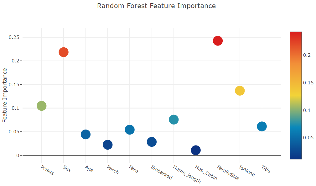


Now let us calculate the mean of all the feature importances and store it as a new column in the feature importance dataframe.
- 모든 feature 중요도의 평균을 계산하여 feature 중요도 데이터 프레임에 새 열로 저장
# Create the new column containing the average of values

feature_dataframe['mean'] = feature_dataframe.mean(axis= 1) # axis = 1 computes the mean row-wise
feature_dataframe.head(3)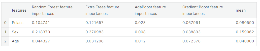
Plotly Barplot of Average Feature Importances
Having obtained the mean feature importance across all our classifiers, we can plot them into a Plotly bar plot as follows:
y = feature_dataframe['mean'].values
x = feature_dataframe['features'].values
data = [go.Bar(
            x= x,
             y= y,
            width = 0.5,
            marker=dict(
               color = feature_dataframe['mean'].values,
            colorscale='Portland',
            showscale=True,
            reversescale = False
            ),
            opacity=0.6
        )]

layout= go.Layout(
    autosize= True,
    title= 'Barplots of Mean Feature Importance',
    hovermode= 'closest',
#     xaxis= dict(
#         title= 'Pop',
#         ticklen= 5,
#         zeroline= False,
#         gridwidth= 2,
#     ),
yaxis=dict(
        title= 'Feature Importance',
        ticklen= 5,
        gridwidth= 2
    ),
    showlegend= False
)
fig = go.Figure(data=data, layout=layout)
py.iplot(fig, filename='bar-direct-labels')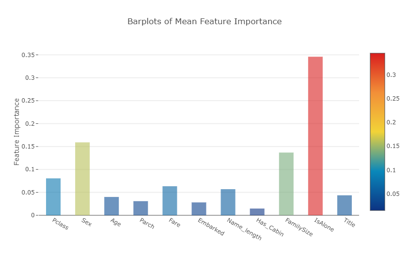
- 각 feature들의 평균 중요도를 표시한 막대 그래프 >>모든 분류기에서 평균 특징 중요도를 얻은 후 다음과 같이 막대 그래프로 표시
Second-Level Predictions from the First-level Output
First-level output as new features
Having now obtained our first-level predictions, one can think of it as essentially building a new set of features to be used as training data for the next classifier. As per the code below, we are therefore having as our new columns the first-level predictions from our earlier classifiers and we train the next classifier on this.
- 첫 번째 단계의 예측에서 얻은 새로운 features의 열(각 feature들의 평균 중요도)을 이용하여 다음 분류기를 훈련
base_predictions_train = pd.DataFrame( {'RandomForest': rf_oof_train.ravel(),
     'ExtraTrees': et_oof_train.ravel(),
     'AdaBoost': ada_oof_train.ravel(),
      'GradientBoost': gb_oof_train.ravel()
    })
base_predictions_train.head()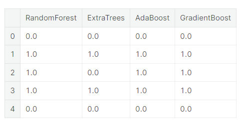
Correlation Heatmap of the Second Level Training set
data = [
    go.Heatmap(
        z= base_predictions_train.astype(float).corr().values ,
        x=base_predictions_train.columns.values,
        y= base_predictions_train.columns.values,
          colorscale='Viridis',
            showscale=True,
            reversescale = True
    )
]
py.iplot(data, filename='labelled-heatmap')
- 두 번째 훈련 세트에 대한 상관관계 heatmap
There have been quite a few articles and Kaggle competition winner stories about the merits of having trained models that are more uncorrelated with one another producing better scores.
- 서로 상관없는 훈련된 모델이 더 나은 점수를 산출하는 메리트에 대하여 기사와 캐글 대회 우승자 관련 이야기가 꽤 있었음
x_train = np.concatenate(( et_oof_train, rf_oof_train, ada_oof_train, gb_oof_train, svc_oof_train), axis=1)
x_test = np.concatenate(( et_oof_test, rf_oof_test, ada_oof_test, gb_oof_test, svc_oof_test), axis=1)
Having now concatenated and joined both the first-level train and test predictions as x_train and x_test, we can now fit a second-level learning model.
Second level learning model via XGBoost
Here we choose the eXtremely famous library for boosted tree learning model, XGBoost. It was built to optimize large-scale boosted tree algorithms. For further information about the algorithm, check out the official documentation.
Anyways, we call an XGBClassifier and fit it to the first-level train and target data and use the learned model to predict the test data as follows:
- XGBoost를 통한 2단계 학습 모델
boosted tree 학습 모델인 XGBoost로 매우 유명한 eXt 라이브러리를 선택 >> 대규모 부스트 트리 알고리즘을 최적화하기 위해 만들어짐 - XGB 분류기를 불러 그것을 1단계 열차와 목표 데이터에 맞추고 학습된 모델을 사용 >> 테스트 데이터를 예측
gbm = xgb.XGBClassifier(
    #learning_rate = 0.02,
 n_estimators= 2000,
 max_depth= 4,
 min_child_weight= 2,
 #gamma=1,
 gamma=0.9,
 subsample=0.8,
 colsample_bytree=0.8,
 objective= 'binary:logistic',
 nthread= -1,
 scale_pos_weight=1).fit(x_train, y_train)
predictions = gbm.predict(x_test)
Just a quick run down of the XGBoost parameters used in the model:
max_depth : How deep you want to grow your tree. Beware if set to too high a number might run the risk of overfitting.
gamma : minimum loss reduction required to make a further partition on a leaf node of the tree. The larger, the more conservative the algorithm will be.
eta : step size shrinkage used in each boosting step to prevent overfitting
Producing the Submission file
Finally having trained and fit all our first-level and second-level models, we can now output the predictions into the proper format for submission to the Titanic competition as follows:
- 마지막으로 모든 1단계 및 2단계 모델을 훈련하고 fit 시킨 후, 다음과 같이 타이타닉 대회에 제출할 수 있는 적절한 형식으로 예측을 출력
# Generate Submission File
StackingSubmission = pd.DataFrame({ 'PassengerId': PassengerId,
                            'Survived': predictions })
StackingSubmission.to_csv("StackingSubmission.csv", index=False)
출처 : https://www.kaggle.com/code/arthurtok/introduction-to-ensembling-stacking-in-python/notebook
'Project > Data Science 프로젝트' 카테고리의 다른 글
| Data Science 프로젝트 (2주차-2) (0) | 2023.03.25 |
|---|---|
| Data Science 프로젝트 (2주차 - 1) (1) | 2023.03.24 |
| Data Science 프로젝트 (1주차 - 3) (0) | 2023.03.18 |
| Data Science 프로젝트 (1주차 - 2) (0) | 2023.03.18 |
| Data Science 프로젝트 (1주차 - 1) (0) | 2023.03.18 |


