Titanic Top 4% with ensemble modeling
1. Introduction
- Feature analysis
- Feature engineering
- Modeling
import pandas as pd
import numpy as np
import matplotlib.pyplot as plt
import seaborn as sns
%matplotlib inline

from collections import Counter

from sklearn.ensemble import RandomForestClassifier, AdaBoostClassifier, GradientBoostingClassifier, ExtraTreesClassifier, VotingClassifier
from sklearn.discriminant_analysis import LinearDiscriminantAnalysis
from sklearn.linear_model import LogisticRegression
from sklearn.neighbors import KNeighborsClassifier
from sklearn.tree import DecisionTreeClassifier
from sklearn.neural_network import MLPClassifier
from sklearn.svm import SVC
from sklearn.model_selection import GridSearchCV, cross_val_score, StratifiedKFold, learning_curve

sns.set(style='white', context='notebook', palette='deep')
데이터 분석을 위해 pandas, numpy, matplotlib, seaborn import 해준 후
사이킷런에서 머신러닝에 필요한 알고리즘들 import해주기
# Load data
##### Load train and Test set

train = pd.read_csv("../input/train.csv")
test = pd.read_csv("../input/test.csv")
IDtest = test["PassengerId"]
2.2 Outlier detection
이상치 탐색 (데이터 내에서 특별히 튀는 수치를 탐색)
# Outlier detection

def detect_outliers(df,n,features):
    """
    Takes a dataframe df of features and returns a list of the indices
    corresponding to the observations containing more than n outliers according
    to the Tukey method.
    """
    outlier_indices = []

    # iterate over features(columns)
    for col in features:
        # 1st quartile (25%)
        Q1 = np.percentile(df[col], 25)
        # 3rd quartile (75%)
        Q3 = np.percentile(df[col],75)
        # Interquartile range (IQR)
        IQR = Q3 - Q1

        # outlier step
        outlier_step = 1.5 * IQR

        # Determine a list of indices of outliers for feature col
        outlier_list_col = df[(df[col] < Q1 - outlier_step) | (df[col] > Q3 + outlier_step )].index

# append the found outlier indices for col to the list of outlier indices
        outlier_indices.extend(outlier_list_col)

    # select observations containing more than 2 outliers
    outlier_indices = Counter(outlier_indices)
    multiple_outliers = list( k for k, v in outlier_indices.items() if v > n )

    return multiple_outliers

# detect outliers from Age, SibSp , Parch and Fare
Outliers_to_drop = detect_outliers(train,2,["Age","SibSp","Parch","Fare"])
이상치를 탐색하는 함수 detect_outliers 만들어주기
- np.percentile() : 사분위 구하기 (자료 집합의 25%, 75%에 포함되는 자료의 산포도) >> 이상치 탐색에 이용됨
- Interquartile range : 자료 집합의 중간 50% 에 포함되는 자료의 산포도
- 이상치 구하는 방법 : 데이터에서 IQR의 1.5배를 벗어나는 데이터는 이상치라고 판별할 수 있다.
- 이상치라고 판별되는 데이터들을 outlier_list_col에 넣어주고 이를 다시 outlier_indices 리스트에 extend 해준다.
- Counter() 함수를 사용하여 outlier_indices에 속해있는 이상치의 개수를 세어준다.
- for k, v in outlier_indices.items() >> 딕셔너리 자료의 키와 값을 쌍으로 반복하기 위해 items()메서드 사용 (여기서 k에는 키, v에는 값이 들어가는 것)
>>Age, Sibsp, Parch, Fare 에서 이상치 탐색하기
저자 코멘터리
Since outliers can have a dramatic effect on the prediction (espacially for regression problems), i choosed to manage them. I used the Tukey method (Tukey JW., 1977) to detect ouliers which defines an interquartile range comprised between the 1st and 3rd quartile of the distribution values (IQR). An outlier is a row that have a feature value outside the (IQR +- an outlier step). I decided to detect outliers from the numerical values features (Age, SibSp, Sarch and Fare). Then, i considered outliers as rows that have at least two outlied numerical values.
train.loc[Outliers_to_drop] # Show the outliers rows출력 결과 10개의 이상치 행 추출
# Drop outliers
train = train.drop(Outliers_to_drop, axis = 0).reset_index(drop=True)
10개의 이상치 (Fare나 SibSp가 다른 값들에 비해 현저히 높은 데이터의 row들) 제거시켜주기
- reset_index : 기존의 행 인덱스를 제거하고 인덱스를 데이터의 자료열로 추가
- reset_index 메서드를 호출할 때 인수 drop=True 로 설정하면 인덱스 열을 보통의 자료열로 올리는 것이 아니라 그냥 버리게 된다. (출처 https://datascienceschool.net/01%20python/04.05%20%EB%8D%B0%EC%9D%B4%ED%84%B0%ED%94%84%EB%A0%88%EC%9E%84%20%EC%9D%B8%EB%8D%B1%EC%8A%A4%20%EC%A1%B0%EC%9E%91.html)
- index를 drop하려면 axis=0으로 설정하고, 컬럼을 drop하려면 axis=1로 설정 (출처 https://for-my-wealthy-life.tistory.com/20)
2.3 joining train and test set
## Join train and test datasets in order to obtain the same number of features during categorical conversion
train_len = len(train)
dataset =  pd.concat(objs=[train, test], axis=0).reset_index(drop=True)
I join train and test datasets to obtain the same number of features during categorical conversion (See feature engineering).
- concat() 명령어는 단순히 데이터를 연결시켜주는 역할을 함 (여기서는 train과 test 연결, axis 옵션이 주어지면 해당 인덱스에 맞게 데이터를 옆으로 이어 붙일 수 있음) (출처 : https://cording-artist.tistory.com/104 )
- 위에서 보았듯이 reset_index(drop=True)라는 것은 인덱스 자료열을 버린다는 뜻
- dataset은 이상치 10개와 인덱스 열을 제거한 상태의 train(훈련시켜야하는 세트이므로 이상치 제거)과 test 데이터프레임을 이어붙인 것!
2.4 check for null and missing values
# Fill empty and NaNs values with NaN
dataset = dataset.fillna(np.nan)

# Check for Null values
dataset.isnull().sum()
Age and Cabin features have an important part of missing values.
Survived missing values correspond to the join testing dataset (Survived column doesn't exist in test set and has been replace by NaN values when concatenating the train and test set)
- DataFrame의 fillna는 DataFrame에 존재하는 NaN값을 어떠한 값으로 채워줌 (출처 : https://cosmosproject.tistory.com/147)
- NaN이란 Not a Number의 약어. 표현 불가능한 수치형 결과, 엑셀 파일을 DataFrame 형태로 받아올 때 비어있는 위치에 NaN이 할당됨 ( 출처 : https://velog.io/@inhwa1025/Python-numpy-NaN%EC%9D%84-None%EC%9C%BC%EB%A1%9C-%EB%B3%80%ED%99%98%ED%95%98%EA%B8%B0)
- test set의 Survived 칼럼은 존재하지 않으며 위에서 train set과 이어붙일 때 NaN 값들로 대체되었음
# Infos
train.info()
train.isnull().sum()

train.head()

train.dtypes

### Summarize data
# Summarie and statistics
train.describe()
데이터의 정보 확인
- .dtypes는 각 칼럼 값들의 데이터 타입 확인, describe()는 요약통계치 제공
3. Feature analysis
3.1 Numerical values
수치형 데이터
# Correlation matrix between numerical values (SibSp Parch Age and Fare values) and Survived
g = sns.heatmap(train[["Survived","SibSp","Parch","Age","Fare"]].corr(),annot=True, fmt = ".2f", cmap = "coolwarm")
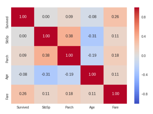
Only Fare feature seems to have a significative correlation with the survival probability.
It doesn't mean that the other features are not usefull. Subpopulations in these features can be correlated with the survival. To determine this, we need to explore in detail these features
수치 데이터들과 Survived 사이의 상관 관계를 나타내는 매트릭스
- heatmap을 이용하면 Target Feature와 나머지 독립변수들의 상관계수를 직관적으로 확인 가능
- 먼저 heatmap에 사용할 데이터.corr()을 통해 사용할 데이터의 상관계수를 가져옴
- annot은 셀 안에 숫자를 출력해주는 것, annot_kws는 그 숫자의 크기를 조정해줄 수 있는 파라미터 역할
- 데이터 분석 결과 Fare 만이 생존 여부와 분명한 상관관계를 지니는 것으로 보임 >> 다른 요소들과 생존 여부의 관계를 알아보기 위해 상세한 탐색을 할 필요가 있음
SibSP
# Explore SibSp feature vs Survived
g = sns.factorplot(x="SibSp",y="Survived",data=train,kind="bar", size = 6 ,
palette = "muted")
g.despine(left=True)
g = g.set_ylabels("survival probability")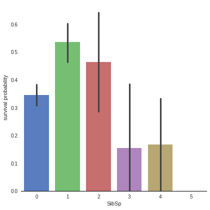
It seems that passengers having a lot of siblings/spouses have less chance to survive
Single passengers (0 SibSP) or with two other persons (SibSP 1 or 2) have more chance to survive
This observation is quite interesting, we can consider a new feature describing these categories (See feature engineering)
- barplot 은 카테고리 값에 따른 실수 값의 평균과 편차를 표시하는 기본적인 바 차트를 생성한다. 평균은 막대의 높이로, 편차는 에러바(error bar)로 표시한다. (출처 : https://datascienceschool.net/01%20python/05.04%20%EC%8B%9C%EB%B3%B8%EC%9D%84%20%EC%82%AC%EC%9A%A9%ED%95%9C%20%EB%8D%B0%EC%9D%B4%ED%84%B0%20%EB%B6%84%ED%8F%AC%20%EC%8B%9C%EA%B0%81%ED%99%94.html)
- plot을 지정한 후, 그 뒤에 sns.despine()이라고 지정하면 테두리를 제거한다. (left=True >> 왼쪽 축 제거)
- y축 이름을 Survival probability로 저장
- 데이터 분석 결과, 가족이 많은 탑승객은 생존 확률 낮음 / 가족이 0인 사람보다 1~2명인 사람이 생존에 유리
Parch
# Explore Parch feature vs Survived
g  = sns.factorplot(x="Parch",y="Survived",data=train,kind="bar", size = 6 ,
palette = "muted")
g.despine(left=True)
g = g.set_ylabels("survival probability")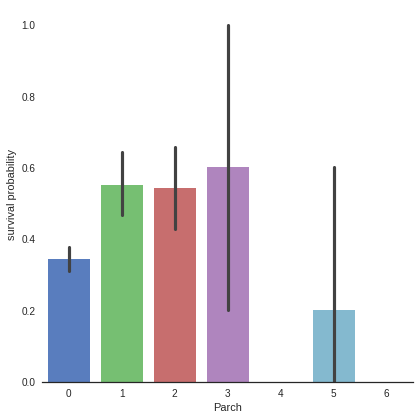
Small families have more chance to survive, more than single (Parch 0), medium (Parch 3,4) and large families (Parch 5,6 ).
Be carefull there is an important standard deviation in the survival of passengers with 3 parents/children
- 소규모 가족(1~2)이 0명, 중간 규모(3~4), 대규모(5~6) 가족보다 생존 확률 높음
- 3인 가족 대상으로 생존률의 편차가 매우 크다는 것에 주의하기!
Age
# Explore Age vs Survived
g = sns.FacetGrid(train, col='Survived')
g = g.map(sns.distplot, "Age")
Age distribution seems to be a tailed distribution, maybe a gaussian distribution.
We notice that age distributions are not the same in the survived and not survived subpopulations. Indeed, there is a peak corresponding to young passengers, that have survived. We also see that passengers between 60-80 have less survived.
So, even if "Age" is not correlated with "Survived", we can see that there is age categories of passengers that of have more or less chance to survive.
It seems that very young passengers have more chance to survive.
- 다양한 범주형 값을 가지는 데이터를 시각화하는데 좋은 방법. 행, 열 방향으로 서로 다른 조건을 적용하여 여러 개의 서브 플롯 제작, 각 서브 플롯에 적용할 그래프 종류를 map() 메서드를 이용하여 그리드 객체에 전달
- FacetGrid에 데이터프레임과 구분할 row, col, hue 등을 전달해 객체 생성 >> 객체(facet)의 map 메서드에 그릴 그래프의 종류와 종류에 맞는 컬럼 전달 / 예시 - distplot의 경우 하나의 컬럼 // scatter의 경우 두개의 컬럼 (출처 : https://steadiness-193.tistory.com/201)
- 나이와 생존여부는 상관관계가 없다고 해도, 더 높은 생존 기회를 갖는 연령대 층은 확인 가능 >> 영유아 연령대 탑승객들은 생존 기회가 높음
# Explore Age distibution
g = sns.kdeplot(train["Age"][(train["Survived"] == 0) & (train["Age"].notnull())], color="Red", shade = True)
g = sns.kdeplot(train["Age"][(train["Survived"] == 1) & (train["Age"].notnull())], ax =g, color="Blue", shade= True)
g.set_xlabel("Age")
g.set_ylabel("Frequency")
g = g.legend(["Not Survived","Survived"])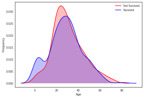
When we superimpose the two densities , we cleary see a peak correponsing (between 0 and 5) to babies and very young childrens.
- Red 그래프 >> Age 칼럼 중 Survived값이 0이고 Age값이 null이 아닌 row 추출, 각 연령대별 빈도 나타냄
- Blue 그래프 >> Age 칼럼 중 Survived값이 1이고 Age값이 null이 아닌 row 추출, 각 연령대별 빈도 나타냄
- 두 그래프 (생존자의 연령대 빈도 & 사망자의 연령대 빈도) 중첩하여 보면 영유아 연령대에서 생존 기회가 높음을 분명하게 확인할 수 있음
Fare
dataset["Fare"].isnull().sum()- 출력값 1 >> null값 1개 존재
Fill Fare missing values with the median value
dataset["Fare"] = dataset["Fare"].fillna(dataset["Fare"].median())
Since we have one missing value, I decided to fill it with the median value which will not have an important effect on the prediction.
- 비어있는 null값을 중간값으로 채워주기 >> 전체 결과에 큰 영향 미치지 않을 것
# Explore Fare distribution
g = sns.distplot(dataset["Fare"], color="m", label="Skewness : %.2f"%(dataset["Fare"].skew()))
g = g.legend(loc="best")
As we can see, Fare distribution is very skewed. This can lead to overweigth very high values in the model, even if it is scaled.
In this case, it is better to transform it with the log function to reduce this skew.
- distplot() : 파이썬의 seaborn 중 distribution(분포)을 표현하는 그래프 (출처 : https://rudolf-2434.tistory.com/9)
- skew는 표본 비대칭도, 자료의 치우친 정도 >> Skewness 척도를 소수 둘째자리까지 나타냄
- 왜도skew() : Skewness를 측정한 값 기준
- 현재 Fare의 비대칭도는 매우 심함, 모델에 영향을 줄 것 >> 값들에 log를 취하여 비대칭도를 줄여야 함
# Apply log to Fare to reduce skewness distribution
dataset["Fare"] = dataset["Fare"].map(lambda i: np.log(i) if i > 0 else 0)- lambda 인자: 표현식 >>lambda 라는 키워드를 입력하고 뒤에는 매개변수(인자)를 입력하고 콜론(:)을 넣은다음에 그 매개변수(인자)를 이용한 동작들을 적으면 됨.
- 예시 : 인자로 들어온 값에 2를 곱해서 반환한다고 하면 lambda x : x * 2 (출처 : https://blockdmask.tistory.com/520)
g = sns.distplot(dataset["Fare"], color="b", label="Skewness : %.2f"%(dataset["Fare"].skew()))
g = g.legend(loc="best")
Skewness is clearly reduced after the log transformation
- 각 값들에 log를 취해준 덕에 이전보다 비대칭도가 감소함
3.2 Categorical values
카테고리형 데이터
Sex
g = sns.barplot(x="Sex",y="Survived",data=train)
g = g.set_ylabel("Survival Probability")
train[["Sex","Survived"]].groupby('Sex').mean()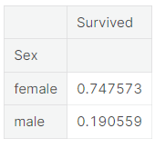
It is clearly obvious that Male have less chance to survive than Female.
So Sex, might play an important role in the prediction of the survival.
For those who have seen the Titanic movie (1997), I am sure, we all remember this sentence during the evacuation : "Women and children first".
- barplot에서 검은 막대는 신뢰도를 나타내며, 기본적으로 95% 의 신뢰도를 가진다 (출처 : https://wpaud16.tistory.com/32)
- groupby()로 각 성별을 기준으로 그룹을 묶은 뒤 각 그룹의 평균 생존률을 표로 나타냄
- 여성의 생존률이 남성보다 높은 것이 분명하게 드러남 >> 성별 또한 생존률 예측에 중요한 영향을 미칠 것
Pclass
# Explore Pclass vs Survived
g = sns.factorplot(x="Pclass",y="Survived",data=train,kind="bar", size = 6 ,
palette = "muted")
g.despine(left=True)
g = g.set_ylabels("survival probability")
# Explore Pclass vs Survived by Sex
g = sns.factorplot(x="Pclass", y="Survived", hue="Sex", data=train,
                   size=6, kind="bar", palette="muted")
g.despine(left=True)
g = g.set_ylabels("survival probability")
The passenger survival is not the same in the 3 classes. First class passengers have more chance to survive than second class and third class passengers.
This trend is conserved when we look at both male and female passengers.
- 첫 번째, 두 번째 그래프에 따르면 남녀 성별에 상관없이 클래스가 좋을수록(낮을수록) 생존률이 높아진다는 사실을 알 수 있음
Embarked
dataset["Embarked"].isnull().sum()>>출력 결과 2, Embarked 칼럼에는 총 2개의 null값 존재함
#Fill Embarked nan values of dataset set with 'S' most frequent value
dataset["Embarked"] = dataset["Embarked"].fillna("S")
Since we have two missing values, I decided to fill them with the most fequent value of "Embarked" (S).
- null값들을 Embarked에서 가장 빈도가 높은 S로 채워줌
# Explore Embarked vs Survived
g = sns.factorplot(x="Embarked", y="Survived",  data=train,
                   size=6, kind="bar", palette="muted")
g.despine(left=True)
g = g.set_ylabels("survival probability")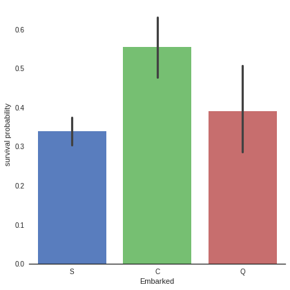
It seems that passenger coming from Cherbourg (C) have more chance to survive.
My hypothesis is that the proportion of first class passengers is higher for those who came from Cherbourg than Queenstown (Q), Southampton (S).
Let's see the Pclass distribution vs Embarked
- 각 탑승구에 따른 생존률을 bar 형태의 그래프로 표현
- C에서 탑승한 사람들의 생존률이 가장 높음
- 앞서 보았다시피 PClass가 1인 사람들의 생존률이 가장 높았으므로, C에서 탑승한 사람들 중 PClass가 1인 사람의 비율이 높을 것이락 추측할 수 있음
# Explore Pclass vs Embarked
g = sns.factorplot("Pclass", col="Embarked",  data=train,
                   size=6, kind="count", palette="muted")
g.despine(left=True)
g = g.set_ylabels("Count")
Indeed, the third class is the most frequent for passenger coming from Southampton (S) and Queenstown (Q), whereas Cherbourg passengers are mostly in first class which have the highest survival rate.
At this point, i can't explain why first class has an higher survival rate. My hypothesis is that first class passengers were prioritised during the evacuation due to their influence.
- 각 탑승구에서 PClass 사람들의 비율을 count 종류의 그래프로 표현
- 실제로 S와 Q에서 PClass가 3인 탑승객들의 비율이 높았고, C에서 PClass가 1인 탑승객들의 비율이 높음
- 실제로 왜 PClass가 1인 탑승객들의 생존율이 높은지 알 수 없지만, 아마 탈출 과정에서 그들의 영향력 덕분에 우선적으로 대피할 수 있지 않았나 하고 추측할 수 있음
4. Filling missing Values
4.1 Age
As we see, Age column contains 256 missing values in the whole dataset.
Since there is subpopulations that have more chance to survive (children for example), it is preferable to keep the age feature and to impute the missing values.
To adress this problem, I looked at the most correlated features with Age (Sex, Parch , Pclass and SibSP).
- 어린이와 같은 생존 가능성이 높은 연령대 집단이 있는 관계로, 연령대 분포의 특정을 지키는 선에서 비어있는 age값들을 채워주는 것이 바람직함
- 비어있는 age값들을 채워주기 위해 성별, PClass와 같이 나이와 상관관계가 있는 특성들을 살펴보아야 함
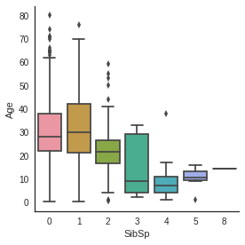
# Explore Age vs Sex, Parch , Pclass and SibSP
g = sns.factorplot(y="Age",x="Sex",data=dataset,kind="box")
g = sns.factorplot(y="Age",x="Sex",hue="Pclass", data=dataset,kind="box")
g = sns.factorplot(y="Age",x="Parch", data=dataset,kind="box")
g = sns.factorplot(y="Age",x="SibSp", data=dataset,kind="box")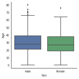


Age distribution seems to be the same in Male and Female subpopulations, so Sex is not informative to predict Age.
However, 1rst class passengers are older than 2nd class passengers who are also older than 3rd class passengers.
Moreover, the more a passenger has parents/children the older he is and the more a passenger has siblings/spouses the younger he is.
- 1) 성별에 따른 나이 그래프 2) 각 PClass별(hue) 성별에 따른 나이 그래프 3) Parch에 따른 나이 그래프 4) SibSp에 따른 나이 그래프 들을 상자그림으로 표현 (상자그림 : 최솟값, 사분위수, 중앙값, 최댓값 표현 + 분포의 모양&분포의 집중도, 범위 등을 한눈에 알 수 있는 그림)
- 나이 분포는 두 성별에서 서로 비슷함
- PClass가 1인 사람들은 2, 3인 사람들보다 연령대가 높음
- 승객이 부모/자녀가 많을수록 연령대가 높은 반면 형제/배우자가 많을수록 연령대가 낮음
# convert Sex into categorical value 0 for male and 1 for female
dataset["Sex"] = dataset["Sex"].map({"male": 0, "female":1})- map() : 각 요소들에 특정한 함수를 적용시킬 때 쓰는 함수 (출처 : https://codinglevelup.tistory.com/83)
g = sns.heatmap(dataset[["Age","Sex","SibSp","Parch","Pclass"]].corr(),cmap="BrBG",annot=True)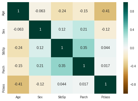
The correlation map confirms the factorplots observations except for Parch. Age is not correlated with Sex, but is negatively correlated with Pclass, Parch and SibSp.
In the plot of Age in function of Parch, Age is growing with the number of parents / children. But the general correlation is negative.
So, i decided to use SibSP, Parch and Pclass in order to impute the missing ages.
The strategy is to fill Age with the median age of similar rows according to Pclass, Parch and SibSp.
- 위 상관관계 그래프에 따르면, 나이는 성별과 상관관계가 있지 않지만, Pclass, Parch, SibSp와 부정적인 상관관계를 가지고 있음
- Age와 Parch의 상관관계를 보면, 부모/자식의 수에 따라 연령대도 높아지고 있으나, 전반적인 상관관계는 부정적임(음수)
- 나이는 Pclass, Parch, SibSp와 상관관계를 가지고 있으므로, 비어있는 Age 데이터들은 Pclass, Parch, SibSp에 따라 채워주는 전략을 사용
# Filling missing value of Age

## Fill Age with the median age of similar rows according to Pclass, Parch and SibSp
# Index of NaN age rows
index_NaN_age = list(dataset["Age"][dataset["Age"].isnull()].index)

for i in index_NaN_age :
    age_med = dataset["Age"].median()
    age_pred = dataset["Age"][((dataset['SibSp'] == dataset.iloc[i]["SibSp"]) & (dataset['Parch'] == dataset.iloc[i]["Parch"]) & (dataset['Pclass'] == dataset.iloc[i]["Pclass"]))].median()
    if not np.isnan(age_pred) :
        dataset['Age'].iloc[i] = age_pred
    else :
dataset['Age'].iloc[i] = age_med- index_NaN_age리스트는 Age값 중 비어있는 row의 index를 넣은 것
g = sns.factorplot(x="Survived", y = "Age",data = train, kind="box")
g = sns.factorplot(x="Survived", y = "Age",data = train, kind="violin")
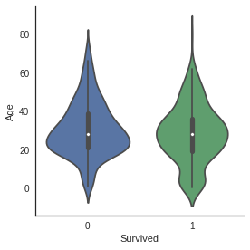
No difference between median value of age in survived and not survived subpopulation.
But in the violin plot of survived passengers, we still notice that very young passengers have higher survival rate.
- 비어있는 나이 데이터들을 채워준 후 나이에 따른 생존률 그래프를 각각 box, violin그래프로 나타냄
- 상자그림에 따라, 생존자의 연령 데이터와 사망자의 연령 데이터의 중간값은 차이가 없음
- violinplot을 통해 매우 어린 연령대의 탑승객들에게서 더 높은 생존률이 나타나는 것을 확인할 수 있음
5. Feature engineering
5.1 Name/Title
dataset["Name"].head()
The Name feature contains information on passenger's title.
Since some passenger with distingused title may be preferred during the evacuation, it is interesting to add them to the model.
- Mr. , Mrs. 와 같이 탑승객의 이름에는 탑승객의 정보(성별, 연령대 등)가 담겨있음
- 탈출할 때 특별한 호칭을 지닌 탑승객이 우선적으로 대피했을 수 있으므로 이 데이터를 모델에 추가해줄 것
# Get Title from Name
dataset_title = [i.split(",")[1].split(".")[0].strip() for i in dataset["Name"]]
dataset["Title"] = pd.Series(dataset_title)
dataset["Title"].head()
0 Mr
1 Mrs
2 Miss
3 Mrs
4 Mr
Name: Title, dtype: object- split()는 특정 문자(여기서는 ',', '.')기준으로 문자열을 나눔
- split(" ") 는 공백 1개, 1개를 각각의 공백으로 따로따로 처리 (출처 : https://somjang.tistory.com/entry/Python-%EB%AC%B8%EC%9E%90%EC%97%B4-split-%EA%B3%BC-split-%EC%B0%A8%EC%9D%B4-%EC%95%8C%EC%95%84%EB%B3%B4%EA%B8%B0)
- split(",")[1]는 ','를 기준으로 나눈 문자열에서 2번째 요소를 뜻함 / split(".")[0]는 '.'를 기준으로 나눈 문자열에서 1번째 요소를 뜻함
- The strip() function removes leading and trailing spaces to return a copy of the original string. By default, the strip() method helps to remove whitespaces from the start and the end of the string. (출처 : https://www.mygreatlearning.com/blog/strip-in-python/) >> strip()는 문자열의 공백 제거해주는 메소드
- 즉 각 이름들에서 우선 ','를 기준으로 앞 부분을 떼어낸 후, '.'를 기준으로 Mr, Mrs 등을 추출하고 strip()으로 공백 제거, 이렇게 해서 모은 요소들을 dataset_title에 저장
g = sns.countplot(x="Title",data=dataset)
g = plt.setp(g.get_xticklabels(), rotation=45) 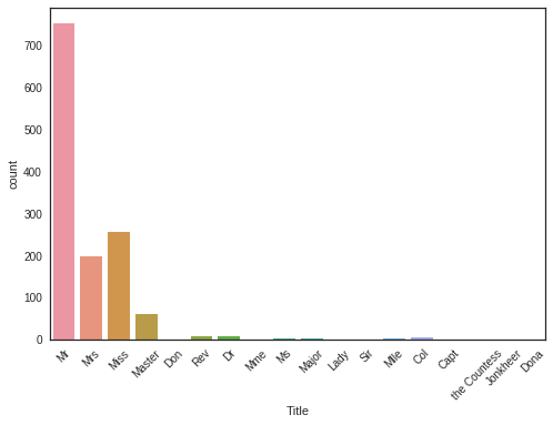
There is 17 titles in the dataset, most of them are very rare and we can group them in 4 categories.
- plt.setp(g.get_xticklabels(), rotation=45) >> x축에 표시되는 좌표(Title)들의 이름을 45도씩 회전하여 겹쳐보이지 않게 만들어줌
- countplot을 이용하여 각 title별로 빈도를 확인해보니 Mr, Mrs, Miss, Master를 제외한 나머지 그룹들에서는 빈도가 매우 낮은 것으로 나타남
# Convert to categorical values Title
dataset["Title"] = dataset["Title"].replace(['Lady', 'the Countess','Countess','Capt', 'Col','Don', 'Dr', 'Major', 'Rev', 'Sir', 'Jonkheer', 'Dona'], 'Rare')
dataset["Title"] = dataset["Title"].map({"Master":0, "Miss":1, "Ms" : 1 , "Mme":1, "Mlle":1, "Mrs":1, "Mr":2, "Rare":3})
dataset["Title"] = dataset["Title"].astype(int)- 4개를 제외한, 매우 드문 빈도의 다른 title들은 하나로 묶어 Rare로 대체
- 여성을 지칭하는 Miss, Ms 등을 하나로 묶어주고 Master, 여성 지칭, Mr, Rare 4개로 구분
- int형 요소들로 변환
g = sns.countplot(dataset["Title"])
g = g.set_xticklabels(["Master","Miss/Ms/Mme/Mlle/Mrs","Mr","Rare"])
g = sns.factorplot(x="Title",y="Survived",data=dataset,kind="bar")
g = g.set_xticklabels(["Master","Miss-Mrs","Mr","Rare"])
g = g.set_ylabels("survival probability")

"Women and children first"
It is interesting to note that passengers with rare title have more chance to survive.
- Rare title, 즉 빈도가 낮았던 title을 지닌 사람들의 생존률이 높음
- Mr에 비해 여성 지칭 title의 생존률이 더 높음
# Drop Name variable
dataset.drop(labels = ["Name"], axis = 1, inplace = True)- 원본 데이터에서 Name을 지움
- 'axis = 1'은 각 행의 모든 열에 대해 동작한다는 의미, 'inplace = True'는 원본 데이터에도 적용한다는 의미
5.2 Family size
We can imagine that large families will have more difficulties to evacuate, looking for theirs sisters/brothers/parents during the evacuation. So, I choosed to create a "Fize" (family size) feature which is the sum of SibSp , Parch and 1 (including the passenger).
# Create a family size descriptor from SibSp and Parch
dataset["Fsize"] = dataset["SibSp"] + dataset["Parch"] + 1- 1을 더한 것은 탑승자 자신을 포함하기 위함
g = sns.factorplot(x="Fsize",y="Survived",data = dataset)
g = g.set_ylabels("Survival Probability")
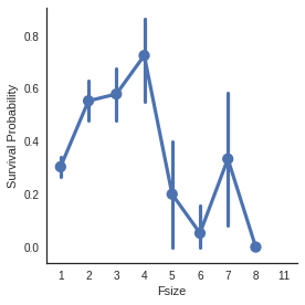
The family size seems to play an important role, survival probability is worst for large families.
Additionally, I decided to created 4 categories of family size.
- 가족의 규모가 크면 >> 생존률 낮아짐
# Create new feature of family size
dataset['Single'] = dataset['Fsize'].map(lambda s: 1 if s == 1 else 0)
dataset['SmallF'] = dataset['Fsize'].map(lambda s: 1 if  s == 2  else 0)
dataset['MedF'] = dataset['Fsize'].map(lambda s: 1 if 3 <= s <= 4 else 0)
dataset['LargeF'] = dataset['Fsize'].map(lambda s: 1 if s >= 5 else 0)- 가족의 규모를 구간별로 나누어 4개의 요소를 만들어줌
g = sns.factorplot(x="Single",y="Survived",data=dataset,kind="bar")
g = g.set_ylabels("Survival Probability")
g = sns.factorplot(x="SmallF",y="Survived",data=dataset,kind="bar")
g = g.set_ylabels("Survival Probability")
g = sns.factorplot(x="MedF",y="Survived",data=dataset,kind="bar")
g = g.set_ylabels("Survival Probability")
g = sns.factorplot(x="LargeF",y="Survived",data=dataset,kind="bar")
g = g.set_ylabels("Survival Probability")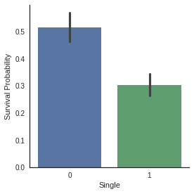
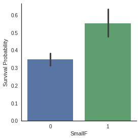
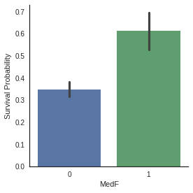

Factorplots of family size categories show that Small and Medium families have more chance to survive than single passenger and large families.
- 가족 규모를 4개의 요소 나눈 후 각 요소를 factorplot의 bar형태 그래프로 표현
- 그래프에 따라 Small과 Medium 범위의 가족 규모는 생존 확률이 높은 반면 single, Large 범위의 가족 규모는 생존 확률 낮음
# convert to indicator values Title and Embarked
dataset = pd.get_dummies(dataset, columns = ["Title"])
dataset = pd.get_dummies(dataset, columns = ["Embarked"], prefix="Em")- 단순히 수치형 데이터로 변환을 하면 실제로는 아무런 관계가 없는 데이터들이 관계성을 갖게 됨 (ex. 월요일 1, 화요일 2, 수요일 3으로 변환하면 '월+화=수'라는 관계성이 생김, 하지만 이러한 관계성은 실제로 존재하지 않음)
- 이를 방지하기 위해 pd.get_dummies()를 사용 >> 수치화된 데이터를 가변수화시킴(서로 무관한 수치로 바꾸기, 0과 1로만 이루어진 열을 만들어줌 (출처 : https://mizykk.tistory.com/13, https://devuna.tistory.com/67)
- prefix = ~ : 문자열 앞에 붙는 알파벳 의미
- 현재 dataset의 Title과 Embarked 칼럼들을 가변수화 시킨 것
dataset.head()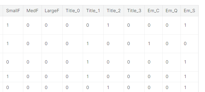
- 데이터들이 가변수화 된 결과 (0과 1로만 이루어진 열을 만들어줌)
At this stage, we have 22 features.
dataset["Cabin"].head()0 NaN
1 C85
2 NaN
3 C123
4 NaN
Name: Cabin, dtype: objectdataset["Cabin"].describe()count 292
unique 186
top B57 B59 B63 B66
freq 5
Name: Cabin, dtype: objectdataset["Cabin"].isnull().sum()1007
The Cabin feature column contains 292 values and 1007 missing values.
I supposed that passengers without a cabin have a missing value displayed instead of the cabin number.
- 'Cabin'의 요약통계치와 null의 개수를 통해 보았을 때, 객실이 없는 승객은 객실 번호가 누락된 것으로 추측할 수 있음
dataset["Cabin"][dataset["Cabin"].notnull()].head()1 C85
3 C123
6 E46
10 G6
11 C103
Name: Cabin, dtype: object# Replace the Cabin number by the type of cabin 'X' if not
dataset["Cabin"] = pd.Series([i[0] if not pd.isnull(i) else 'X' for i in dataset['Cabin'] ])The first letter of the cabin indicates the Desk, i choosed to keep this information only, since it indicates the probable location of the passenger in the Titanic.
- pd.Series() >> 새로운 "Cabin" 시리즈 만들기
- 객실 번호가 존재하면(pd.isnull(i)가 False이면) >> 문자열의 첫 번째 요소 i[0] (C, E 등)
- 객실 번호가 존재하지 않으면(pd.isnull(i)가 True이면) >> X로 null값 대체
g = sns.countplot(dataset["Cabin"],order=['A','B','C','D','E','F','G','T','X'])
- 각 객실의 빈도수를 countplot()로 나타냄
g = sns.factorplot(y="Survived",x="Cabin",data=dataset,kind="bar",order=['A','B','C','D','E','F','G','T','X'])
g = g.set_ylabels("Survival Probability")
Because of the low number of passenger that have a cabin, survival probabilities have an important standard deviation and we can't distinguish between survival probability of passengers in the different desks.
But we can see that passengers with a cabin have generally more chance to survive than passengers without (X).
It is particularly true for cabin B, C, D, E and F.
- 위의 countplot()에서 알 수 있듯, 객실이 있는 사람이 현저히 적기 때문에 생존율에 대한 표준 편차가 중요한 비중을 차지함
- 객실이 있는 탑승객(A~G)의 생존율이 객실이 없는 탑승객 (X)의 생존율보다 현저히 높음 (특히 객실 B, C, D, E, F에서나타남)
dataset = pd.get_dummies(dataset, columns = ["Cabin"],prefix="Cabin")- Cabin 데이터 가변수화 >> 모델에 적용 가능하도록!
5.4 Ticket
dataset["Ticket"].head()
0           A/5 21171
1            PC 17599
2    STON/O2. 3101282
3              113803
4              373450
Name: Ticket, dtype: object
It could mean that tickets sharing the same prefixes could be booked for cabins placed together. It could therefore lead to the actual placement of the cabins within the ship.
Tickets with same prefixes may have a similar class and survival.
So i decided to replace the Ticket feature column by the ticket prefixe. Which may be more informative.
- Ticket 이름의 앞부분이 같으면 같은 Cabin에 속한다는 것을 확인할 수 있음 >> 앞에 오는 단어로 Ticket feature를 대체
## Treat Ticket by extracting the ticket prefix. When there is no prefix it returns X.

Ticket = []
for i in list(dataset.Ticket):
    if not i.isdigit() :
        Ticket.append(i.replace(".","").replace("/","").strip().split(' ')[0]) #Take prefix
    else:
        Ticket.append("X")

dataset["Ticket"] = Ticket
dataset["Ticket"].head()- isdigit() 함수는 문자열이 숫자로 구성되어 있는지 판별해주는 함수, 다만 음수나 소수점 있으면 False 반환 (출처 : https://onthepressure.tistory.com/entry/Python-String-isdigit-Method-%EB%AC%B8%EC%9E%90%EC%97%B4-%ED%95%A8%EC%88%98)
- i 가 숫자로 구성되어있지 않은 경우 (기존의 1번째, 2번째 값) >> "."을 공복으로 대체, "/"를 공백으로 대체, strip()는 문자열의 공백 제거해주는 메소드, split(' ')으로 공백 기준으로 문자열 나눈 후 첫 번째 요소를 Ticket 리스트에 append
- i가 숫자로 구성됨 (기존의 4번째, 5번째 값) >> Ticket 리스트에 'x' append
0        A5
1        PC
2    STONO2
3         X
4         X
Name: Ticket, dtype: object
dataset = pd.get_dummies(dataset, columns = ["Ticket"], prefix="T")- Ticket 앞에 T 붙임
- Ticket 데이터 가변수화 >> 모델에 적용 가능
# Create categorical values for Pclass
dataset["Pclass"] = dataset["Pclass"].astype("category")
dataset = pd.get_dummies(dataset, columns = ["Pclass"],prefix="Pc")- .astype("category") >> Pclass의 원본 데이터를 category로 형변환
- Pclass 데이터 가변수화(위의 요일 데이터를 pd.get_dummies를 이용하여 가변수화 한 것과 비슷한 경우)
# Drop useless variables
dataset.drop(labels = ["PassengerId"], axis = 1, inplace = True)- 불필요한 PassengerId label은 삭제
- axis=1은 각 행의 모든 열에 대해서 동작, inplace = True로 원본 데이터에도 적용
dataset.head()
- Ticket 데이터와 Pclass 데이터가 가변수화 되었음 (0과 1로만 이루어진 열들 만들어줌)
6. MODELING
## Separate train dataset and test dataset

train = dataset[:train_len]
test = dataset[train_len:]
test.drop(labels=["Survived"],axis = 1,inplace=True)- 훈련 세트와 테스트 세트로 나누어준 뒤 테스트 세트에서 Survived label을 제거
## Separate train features and label

train["Survived"] = train["Survived"].astype(int)

Y_train = train["Survived"]

X_train = train.drop(labels = ["Survived"],axis = 1)- train["Survived"]의 자료형을 int형 (정수형)으로 바꿔줌
- Y_train에 훈련 세트의 Survived label 넣어주고, X_train에 Survived label이 제거된 훈련 세트 넣어줌 >> label 분리
6.1 Simple modeling
6.1.1 Cross validate models
I compared 10 popular classifiers and evaluate the mean accuracy of each of them by a stratified kfold cross validation procedure.
- SVC
- Decision Tree
- AdaBoost
- Random Forest
- Extra Trees
- Gradient Boosting
- Multiple layer perceprton (neural network)
- KNN
- Logistic regression
- Linear Discriminant Analysis
# Cross validate model with Kfold stratified cross val
kfold = StratifiedKFold(n_splits=10)생물정보 전문위키, 인코덤
Wikipedia for Bioinformatics
www.incodom.kr
- 위 링크에서 kfold 교차검증 모델에 대한 자세한 설명을 읽을 수 있었다
- 교차 검증이란 데이터를 여러 번 반복해서 나누고 여러 모델을 학습하여 성능을 평가하는 방법
- k-겹 교차 검증은 데이터를 여러 개로 나누어 검증하는 방법으로, 하이퍼파라미터나 모델의 최적화 시, 최적의 조건을 찾는 데에 활용할 수 있다. 또 모든 데이터를 평가와 학습에 사용할 수 있어 알고리즘의 일반화 정도를 평가할 수 있다. 하지만 데이터 세트를 k번 나누어 학습하는 만큼, 일반적인 분할 방법에 비해 학습과 평가에 소요되는 연산 비용이 늘어난다는 단점이 있다.
# Modeling step Test differents algorithms
random_state = 2
classifiers = []
classifiers.append(SVC(random_state=random_state))
classifiers.append(DecisionTreeClassifier(random_state=random_state))
classifiers.append(AdaBoostClassifier(DecisionTreeClassifier(random_state=random_state),random_state=random_state,learning_rate=0.1))
classifiers.append(RandomForestClassifier(random_state=random_state))
classifiers.append(ExtraTreesClassifier(random_state=random_state))
classifiers.append(GradientBoostingClassifier(random_state=random_state))
classifiers.append(MLPClassifier(random_state=random_state))
classifiers.append(KNeighborsClassifier())
classifiers.append(LogisticRegression(random_state = random_state))
classifiers.append(LinearDiscriminantAnalysis())
cv_results = []
for classifier in classifiers :
cv_results.append(cross_val_score(classifier, X_train, y = Y_train, scoring = "accuracy", cv = kfold, n_jobs=4))
cv_means = []
cv_std = []
for cv_result in cv_results:
cv_means.append(cv_result.mean())
cv_std.append(cv_result.std())
cv_res = pd.DataFrame({"CrossValMeans":cv_means,"CrossValerrors": cv_std,"Algorithm":["SVC","DecisionTree","AdaBoost",
"RandomForest","ExtraTrees","GradientBoosting","MultipleLayerPerceptron","KNeighboors","LogisticRegression","LinearDiscriminantAnalysis"]})
g = sns.barplot("CrossValMeans","Algorithm",data = cv_res, palette="Set3",orient = "h",**{'xerr':cv_std})
g.set_xlabel("Mean Accuracy")
g = g.set_title("Cross validation scores")/opt/conda/lib/python3.6/site-packages/sklearn/discriminant_analysis.py:388: UserWarning: Variables are collinear.
warnings.warn("Variables are collinear.")
/opt/conda/lib/python3.6/site-packages/sklearn/discriminant_analysis.py:388: UserWarning: Variables are collinear.
warnings.warn("Variables are collinear.")
/opt/conda/lib/python3.6/site-packages/sklearn/discriminant_analysis.py:388: UserWarning: Variables are collinear.
warnings.warn("Variables are collinear.")
/opt/conda/lib/python3.6/site-packages/sklearn/discriminant_analysis.py:388: UserWarning: Variables are collinear.
warnings.warn("Variables are collinear.")
I decided to choose the SVC, AdaBoost, RandomForest , ExtraTrees and the GradientBoosting classifiers for the ensemble modeling.
- 각 모델을 훈련시킨 후 교차검증스코어가 높은 상위 4개의 모델 채택
6.1.2 Hyperparameter tunning for best models
I performed a grid search optimization for AdaBoost, ExtraTrees , RandomForest, GradientBoosting and SVC classifiers.
I set the "n_jobs" parameter to 4 since i have 4 cpu . The computation time is clearly reduced.
But be carefull, this step can take a long time, i took me 15 min in total on 4 cpu.
### META MODELING  WITH ADABOOST, RF, EXTRATREES and GRADIENTBOOSTING

# Adaboost
DTC = DecisionTreeClassifier()

adaDTC = AdaBoostClassifier(DTC, random_state=7)

ada_param_grid = {"base_estimator__criterion" : ["gini", "entropy"],
              "base_estimator__splitter" :   ["best", "random"],
              "algorithm" : ["SAMME","SAMME.R"],
              "n_estimators" :[1,2],
              "learning_rate":  [0.0001, 0.001, 0.01, 0.1, 0.2, 0.3,1.5]}

gsadaDTC = GridSearchCV(adaDTC,param_grid = ada_param_grid, cv=kfold, scoring="accuracy", n_jobs= 4, verbose = 1)

gsadaDTC.fit(X_train,Y_train)

ada_best = gsadaDTC.best_estimator_
Fitting 10 folds for each of 112 candidates, totalling 1120 fits
[Parallel(n_jobs=4)]: Done 608 tasks      | elapsed:    4.1s
[Parallel(n_jobs=4)]: Done 1120 out of 1120 | elapsed:    7.3s finished
gsadaDTC.best_score_
0.82406356413166859#ExtraTrees
ExtC = ExtraTreesClassifier()
## Search grid for optimal parameters
ex_param_grid = {"max_depth": [None],
"max_features": [1, 3, 10],
"min_samples_split": [2, 3, 10],
"min_samples_leaf": [1, 3, 10],
"bootstrap": [False],
"n_estimators" :[100,300],
"criterion": ["gini"]}
gsExtC = GridSearchCV(ExtC,param_grid = ex_param_grid, cv=kfold, scoring="accuracy", n_jobs= 4, verbose = 1)
gsExtC.fit(X_train,Y_train)
ExtC_best = gsExtC.best_estimator_
# Best score
gsExtC.best_score_Fitting 10 folds for each of 54 candidates, totalling 540 fits
[Parallel(n_jobs=4)]: Done  42 tasks      | elapsed:   10.8s
[Parallel(n_jobs=4)]: Done 192 tasks      | elapsed:   37.1s
[Parallel(n_jobs=4)]: Done 442 tasks      | elapsed:  1.5min
[Parallel(n_jobs=4)]: Done 540 out of 540 | elapsed:  1.8min finished
0.82973893303064694# Gradient boosting tunning
GBC = GradientBoostingClassifier()
gb_param_grid = {'loss' : ["deviance"],
'n_estimators' : [100,200,300],
'learning_rate': [0.1, 0.05, 0.01],
'max_depth': [4, 8],
'min_samples_leaf': [100,150],
'max_features': [0.3, 0.1]
}
gsGBC = GridSearchCV(GBC,param_grid = gb_param_grid, cv=kfold, scoring="accuracy", n_jobs= 4, verbose = 1)
gsGBC.fit(X_train,Y_train)
GBC_best = gsGBC.best_estimator_
# Best score
gsGBC.best_score_Fitting 10 folds for each of 72 candidates, totalling 720 fits
[Parallel(n_jobs=4)]: Done  76 tasks      | elapsed:    6.3s
[Parallel(n_jobs=4)]: Done 376 tasks      | elapsed:   29.6s
[Parallel(n_jobs=4)]: Done 720 out of 720 | elapsed:   56.6s finished
0.83087400681044266### SVC classifier
SVMC = SVC(probability=True)
svc_param_grid = {'kernel': ['rbf'],
'gamma': [ 0.001, 0.01, 0.1, 1],
'C': [1, 10, 50, 100,200,300, 1000]}
gsSVMC = GridSearchCV(SVMC,param_grid = svc_param_grid, cv=kfold, scoring="accuracy", n_jobs= 4, verbose = 1)
gsSVMC.fit(X_train,Y_train)
SVMC_best = gsSVMC.best_estimator_
# Best score
gsSVMC.best_score_Fitting 10 folds for each of 28 candidates, totalling 280 fits
[Parallel(n_jobs=4)]: Done  42 tasks      | elapsed:    8.3s
[Parallel(n_jobs=4)]: Done 192 tasks      | elapsed:   38.6s
[Parallel(n_jobs=4)]: Done 280 out of 280 | elapsed:  1.0min finished
0.833144154370034086.1.3 Plot learning curves
Learning curves are a good way to see the overfitting effect on the training set and the effect of the training size on the accuracy.
def plot_learning_curve(estimator, title, X, y, ylim=None, cv=None,
                        n_jobs=-1, train_sizes=np.linspace(.1, 1.0, 5)):
    """Generate a simple plot of the test and training learning curve"""
    plt.figure()
    plt.title(title)
    if ylim is not None:
        plt.ylim(*ylim)
    plt.xlabel("Training examples")
    plt.ylabel("Score")
    train_sizes, train_scores, test_scores = learning_curve(
        estimator, X, y, cv=cv, n_jobs=n_jobs, train_sizes=train_sizes)
    train_scores_mean = np.mean(train_scores, axis=1)
    train_scores_std = np.std(train_scores, axis=1)
    test_scores_mean = np.mean(test_scores, axis=1)
    test_scores_std = np.std(test_scores, axis=1)
    plt.grid()

    plt.fill_between(train_sizes, train_scores_mean - train_scores_std,
                     train_scores_mean + train_scores_std, alpha=0.1,
                     color="r")
    plt.fill_between(train_sizes, test_scores_mean - test_scores_std,
                     test_scores_mean + test_scores_std, alpha=0.1, color="g")
    plt.plot(train_sizes, train_scores_mean, 'o-', color="r",
             label="Training score")
    plt.plot(train_sizes, test_scores_mean, 'o-', color="g",
             label="Cross-validation score")

    plt.legend(loc="best")
    return plt

g = plot_learning_curve(gsRFC.best_estimator_,"RF mearning curves",X_train,Y_train,cv=kfold)
g = plot_learning_curve(gsExtC.best_estimator_,"ExtraTrees learning curves",X_train,Y_train,cv=kfold)
g = plot_learning_curve(gsSVMC.best_estimator_,"SVC learning curves",X_train,Y_train,cv=kfold)
g = plot_learning_curve(gsadaDTC.best_estimator_,"AdaBoost learning curves",X_train,Y_train,cv=kfold)
g = plot_learning_curve(gsGBC.best_estimator_,"GradientBoosting learning curves",X_train,Y_train,cv=kfold)


GradientBoosting and Adaboost classifiers tend to overfit the training set. According to the growing cross-validation curves GradientBoosting and Adaboost could perform better with more training examples.
SVC and ExtraTrees classifiers seem to better generalize the prediction since the training and cross-validation curves are close together.
6.1.4 Feature importance of tree based classifiers
In order to see the most informative features for the prediction of passengers survival, i displayed the feature importance for the 4 tree based classifiers.
nrows = ncols = 2
fig, axes = plt.subplots(nrows = nrows, ncols = ncols, sharex="all", figsize=(15,15))

names_classifiers = [("AdaBoosting", ada_best),("ExtraTrees",ExtC_best),("RandomForest",RFC_best),("GradientBoosting",GBC_best)]

nclassifier = 0
for row in range(nrows):
    for col in range(ncols):
        name = names_classifiers[nclassifier][0]
        classifier = names_classifiers[nclassifier][1]
        indices = np.argsort(classifier.feature_importances_)[::-1][:40]
        g = sns.barplot(y=X_train.columns[indices][:40],x = classifier.feature_importances_[indices][:40] , orient='h',ax=axes[row][col])
        g.set_xlabel("Relative importance",fontsize=12)
        g.set_ylabel("Features",fontsize=12)
        g.tick_params(labelsize=9)
        g.set_title(name + " feature importance")
        nclassifier += 1
I plot the feature importance for the 4 tree based classifiers (Adaboost, ExtraTrees, RandomForest and GradientBoosting).
We note that the four classifiers have different top features according to the relative importance. It means that their predictions are not based on the same features. Nevertheless, they share some common important features for the classification , for example 'Fare', 'Title_2', 'Age' and 'Sex'.
Title_2 which indicates the Mrs/Mlle/Mme/Miss/Ms category is highly correlated with Sex.
We can say that:
- Pc_1, Pc_2, Pc_3 and Fare refer to the general social standing of passengers.
- Sex and Title_2 (Mrs/Mlle/Mme/Miss/Ms) and Title_3 (Mr) refer to the gender.
- Age and Title_1 (Master) refer to the age of passengers.
- Fsize, LargeF, MedF, Single refer to the size of the passenger family.
According to the feature importance of this 4 classifiers, the prediction of the survival seems to be more associated with the Age, the Sex, the family size and the social standing of the passengers more than the location in the boat.
test_Survived_RFC = pd.Series(RFC_best.predict(test), name="RFC")
test_Survived_ExtC = pd.Series(ExtC_best.predict(test), name="ExtC")
test_Survived_SVMC = pd.Series(SVMC_best.predict(test), name="SVC")
test_Survived_AdaC = pd.Series(ada_best.predict(test), name="Ada")
test_Survived_GBC = pd.Series(GBC_best.predict(test), name="GBC")


# Concatenate all classifier results
ensemble_results = pd.concat([test_Survived_RFC,test_Survived_ExtC,test_Survived_AdaC,test_Survived_GBC, test_Survived_SVMC],axis=1)


g= sns.heatmap(ensemble_results.corr(),annot=True)
The prediction seems to be quite similar for the 5 classifiers except when Adaboost is compared to the others classifiers.
The 5 classifiers give more or less the same prediction but there is some differences. Theses differences between the 5 classifier predictions are sufficient to consider an ensembling vote.
6.2 Ensemble modeling
6.2.1 Combining models
I choosed a voting classifier to combine the predictions coming from the 5 classifiers.
I preferred to pass the argument "soft" to the voting parameter to take into account the probability of each vote.
votingC = VotingClassifier(estimators=[('rfc', RFC_best), ('extc', ExtC_best),
('svc', SVMC_best), ('adac',ada_best),('gbc',GBC_best)], voting='soft', n_jobs=4)

votingC = votingC.fit(X_train, Y_train)
6.3 Prediction
6.3.1 Predict and Submit results
test_Survived = pd.Series(votingC.predict(test), name="Survived")

results = pd.concat([IDtest,test_Survived],axis=1)

results.to_csv("ensemble_python_voting.csv",index=False)'Project > Data Science 프로젝트' 카테고리의 다른 글
| Data Science 프로젝트 (2주차-2) (0) | 2023.03.25 |
|---|---|
| Data Science 프로젝트 (2주차 - 1) (1) | 2023.03.24 |
| Data Science 프로젝트 (1주차 - 4) (0) | 2023.03.18 |
| Data Science 프로젝트 (1주차 - 2) (0) | 2023.03.18 |
| Data Science 프로젝트 (1주차 - 1) (0) | 2023.03.18 |


